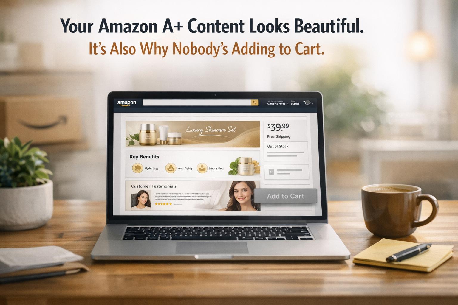
Your Amazon A+ Content might look stunning, but if shoppers aren’t clicking “Add to Cart,” there’s a problem. Beautiful design alone doesn’t sell – clear, mobile-friendly, and benefit-driven content does. Over 70% of Amazon traffic comes from mobile devices, and cluttered layouts, hard-to-read text, or generic visuals can frustrate shoppers. Here’s what you need to know:
- Shoppers want answers fast: Highlight product benefits and key details upfront. Avoid long paragraphs or vague claims like “premium quality.”
- Mobile optimization is critical: Small text, text embedded in images, and poor layouts alienate mobile users.
- Dynamic layouts drive engagement: Use varied modules like comparison charts, grids, and banners instead of repetitive designs.
- Testing boosts conversions: Use Amazon’s “Manage Your Experiments” tool to test and refine your content regularly.
Focusing on usability and clarity over aesthetics can turn your A+ Content into a powerful sales tool. Even small changes – like using scannable text, benefit-focused infographics, and mobile-friendly layouts – can significantly increase conversions.
Amazon A+ Content Tips That Actually Boost Conversions in 2025 | Amazon Listing Optimization Guide
Why Good-Looking A+ Content Doesn’t Convert
Your A+ Content might look like it belongs in a glossy magazine with its professional photography, polished graphics, and sleek layout. But here’s the catch: high traffic doesn’t always mean high sales. If your sessions are climbing but your add-to-cart rate stays stuck, that gorgeous design could actually be holding you back.
Amazon shoppers aren’t just browsing for eye candy – they’re hunting for specific product details. When your content prioritizes visuals over clarity, you’re making them work too hard to find the answers they need. And on Amazon, if customers have to work, they don’t convert – they leave.
Let’s dive into why design-first thinking can sabotage your sales strategy.
The Problem with Design-First Thinking
At first glance, focusing on design seems like a smart move. After all, eye-catching content grabs attention, right? But here’s the problem: content that’s visually impressive often fails to communicate why someone should buy. Sure, decorative lifestyle images might look appealing, but they don’t deliver the concrete information that shoppers are actively searching for.
Amazon shoppers are scanners, not readers. They’re skimming for quick, actionable details – dimensions, materials, certifications, or specific use cases. Filling your A+ modules with generic stock photos or vague phrases like "premium quality" doesn’t cut it. Take this example: a wellness supplement brand initially relied on text-heavy images and bland visuals in their A+ Content, resulting in a 7.2% conversion rate. After swapping those elements for benefit-focused infographics and a comparison chart, their conversion rate soared to 13.6% – an 88% increase – and they snagged the #1 Best Seller badge within just 90 days.
Another common misstep? Uniform layouts. Using identical module structures creates a "visual dead-end" that discourages scrolling. To keep shoppers engaged, your content needs variety – grids, banners, comparison charts – not just consistent branding.
This issue becomes even more pronounced on mobile, where readability and layout are critical.
Mobile Users Can’t Read Your Content
With over 70% of Amazon traffic coming from mobile devices, failing to optimize your content for a 6-inch screen means alienating most of your audience.
One of the biggest mobile mistakes? Embedding text directly into images. What looks sharp on a desktop often becomes a blurry, unreadable mess on mobile. If your text is smaller than 16 pixels, shoppers will need to pinch and zoom – and most won’t bother. Plus, embedding text in images hurts your SEO since search engines can’t crawl it.
Another issue is how desktop-designed images often crop poorly on mobile, cutting off critical product details or making layouts appear disorganized. A consumer electronics brand addressed this by creating mobile-first A+ Content. The result? A 17% increase in conversion rates and a 12% boost in repeat purchases within 60 days. The takeaway? Don’t rely solely on Seller Central‘s preview tool – test your content on actual smartphones to ensure it’s mobile-friendly.
Prioritizing clarity over aesthetics is the key to driving conversions, no matter the device.
Design Mistakes That Kill Sales
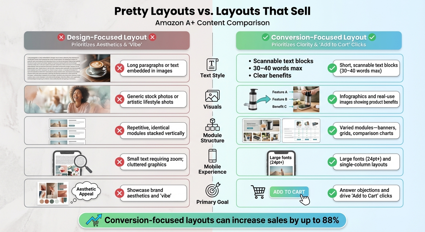
Design-Focused vs Conversion-Focused Amazon A+ Content Layouts
Building on why design-first thinking often misses the mark, let’s dive into specific design missteps that can seriously hurt your sales. These are common errors that keep shoppers from clicking that all-important "Add to Cart" button.
Pretty Layouts vs. Layouts That Sell
A visually pleasing design is great, but if it doesn’t drive conversions, it’s not doing its job. Let’s break down the key differences between layouts that prioritize aesthetics and those that focus on making sales:
| Feature | Design-Focused Layout | Conversion-Focused Layout |
|---|---|---|
| Text Style | Long paragraphs or text embedded in images | Short, scannable text blocks (30–40 words max) |
| Visuals | Generic stock photos or artistic lifestyle shots | Infographics and real-use images showing product benefits |
| Module Structure | Repetitive, identical modules stacked vertically | Varied modules – banners, grids, comparison charts |
| Mobile Experience | Small text requiring zoom; cluttered graphics | Large fonts (24pt+) and single-column layouts |
| Primary Goal | Showcase brand aesthetics and "vibe" | Answer objections and drive "Add to Cart" clicks |
When you rely on a design-focused layout, you risk creating what experts call "visual dead-ends." This happens when repetitive, identical modules bore shoppers, causing their attention to stall. In contrast, conversion-focused layouts keep things dynamic with elements like banners, grids of product images, and comparison charts. These layouts encourage scrolling and keep customers engaged.
Another critical factor? Your text. It needs to be clear, concise, and focused on benefits – not bogged down with unnecessary details.
Text That’s Hard to Read or Doesn’t Explain Benefits
Shoppers, especially on platforms like Amazon, tend to scan rather than read. If your product description is buried in dense paragraphs, you’re making them work too hard for basic details. And when information is hard to find, they’ll simply move on to a competitor.
Embedding text in images is another common pitfall. Not only does this hurt mobile readability, but it also negatively impacts SEO . What’s worse, generic claims like "premium quality" or "eco-friendly" don’t mean much without concrete proof.
Take, for example, a PickFu study on Everyman Jack’s deodorant A+ Content. Their hero image featured a shirtless model, which caught attention but didn’t result in clicks. Why? Because shoppers were looking for practical details like scent and ingredients – not just decorative visuals. As PickFu aptly explains:
"Images pull shoppers in, but it’s the copy, charts, and storytelling below the fold that seal the deal".
If your text doesn’t clearly communicate benefits – like saying "keeps drinks cold for 24 hours" instead of using jargon like "double-wall insulation" – you risk losing potential buyers. Shoppers don’t care about features; they care about what those features will do for them.
Up next, we’ll explore how to combine compelling visuals with benefit-driven text to maximize conversions.
sbb-itb-e2944f4
How to Make A+ Content That Converts
Turning great design into a tool for driving sales means syncing visuals, text, and data seamlessly. Here’s how to make it happen.
Combine Images with Clear, Benefit-Focused Text
Pairing bold visuals with sharp, benefit-driven text is key to boosting conversions.
Start with a hero banner that highlights your product and includes a concise value proposition. For instance, instead of using technical terms, go for something like, “Keeps drinks cold for 24 hours.” Keep feature descriptions short – 2 to 5 words – so shoppers can quickly spot what makes your product stand out.
Avoid embedding text directly into images. Why? Because resizing on mobile devices can make the text hard to read. Instead, use Amazon’s A+ modules to position text in designated areas. Keep text blocks brief (around 30–40 words) and center your key visuals to ensure they’re visible across all screen sizes.
Use these text areas to answer common customer questions. If people often ask about the quality of materials or specific ingredients, address those concerns directly in your A+ Content. Daisy Quaker, Sr. Marketing Manager at Amazon, explains the importance of this balance:
“Images capture attention, while text provides context that can mean the difference between a sale or no sale.”
Structure your modules thoughtfully: start with the hero banner, follow up with scannable icons, include lifestyle images showing the product in action, and finish with technical details. This sequence guides shoppers from curiosity to confidence, making them more likely to hit “Buy.”
Finally, use data to fine-tune your layout and ensure it’s working as hard as it can.
Use Testing Data to Choose Layouts
Data-backed testing can increase sales by up to 25%. Amazon’s “Manage Your Experiments” tool allows you to split traffic between different versions of your A+ Content to see which one performs better. Focus on testing elements like the hero banner and the first two modules, as these create the all-important first impression. Ensure the versions you test have clear and meaningful differences.
Run your tests until they reach statistical significance in Seller Central, which usually takes 4–10 weeks. Pay close attention to metrics like “Units Sold per Unique Visitor” and “Conversion Rate” to measure the direct impact of your layout.
Ben Huge, Brand Manager at Onkata Hardware Sales, Inc., highlights the value of this approach:
“With Manage Your Experiments, we can explain what’s going on in a customer’s marketplace. We justify the changes or recommendations we want to make thanks to the data.”
Interestingly, interactive modules aren’t always the best choice. For instance, during a split test for the brand ciao! baby, SupplyKick discovered that static A+ Content outperformed interactive designs. It’s a good idea to retest your content every 3–6 months, as shopper behaviors and competitive trends evolve.
Once you’ve nailed your layout, focus on adding modules that actively encourage purchases.
Add Modules That Drive Purchases
Certain modules are essential for driving conversions. Comparison charts, for example, are a must-have. They let shoppers quickly compare features side by side without leaving your listing. Premium versions of these charts are even better, as they include shoppable elements like “Add to Cart” buttons, pricing, and customer reviews.
Video modules in Premium A+ Content can also be game-changers. Research shows that customers who watch product videos are 3.6 times more likely to make a purchase, and 96.3% of shoppers say video is a critical part of their product research. Adding Q&A sections is another smart move – it helps address common questions or objections before they become reasons not to buy.
Take this example: In 2025, a wellness supplement brand in the nootropics category revamped their A+ Content by swapping out generic stock photos for custom lifestyle images, adding a comparison chart, and incorporating interactive carousels and Q&A modules. The result? Their conversion rate shot up from 7.2% to 13.6% – an 88% increase – and they earned the #1 Best Seller Badge in their sub-category within just 90 days.
Make the most of the available modules – 5 for Basic A+ Content and 7 for Premium – to maximize your page’s potential and keep shoppers engaged longer. Remember, Basic A+ Content can boost sales by up to 8%, while Premium A+ Content can drive up to 20% more sales.
Track Performance and Keep Improving
A+ Content isn’t something you can just set and forget. With shifting shopper preferences and competitors constantly upgrading their strategies, failing to keep up can cost you thousands in lost revenue. That’s why it’s essential to track your performance and make updates to stay ahead.
Metrics to Watch
Start by focusing on the metrics that matter most. Four key areas to monitor are sales performance, shopper engagement, traffic quality, and customer satisfaction.
- Sales performance: Keep an eye on your conversion rate, total units sold, and revenue. These numbers show whether your content is effectively driving purchases.
- Engagement metrics: These tell you if shoppers are interacting with your content or just scrolling past it. Look at stats like sales per unique visitor, add-to-cart ratio, and dwell time. If you’re using Premium A+ Content, track video views and interactions with carousels or hotspots.
- Traffic quality: High bounce rates and low session values are red flags that your content isn’t resonating with visitors.
- Customer satisfaction: Pay attention to return rates and the number of questions in your Q&A section. These can highlight gaps in your content that need to be addressed.
Update Content Regularly and Test New Layouts
Tracking metrics is just the first step. To maintain strong sales, you need to regularly refine your A+ Content. Plan to update your content at least every six months, or sooner if you release a new product version, rebrand, or notice a dip in conversion rates. Seasonal trends and shifts in shopper behavior also make it important to schedule reviews every 3–6 months.
When refreshing your content, focus on improving clarity and usability. Use Amazon’s "Manage Your Experiments" tool to test specific elements. Change up image layouts, tweak infographic colors, or experiment with different call-to-action styles. Even small adjustments can make a big impact. For instance, Onkata Hardware Sales, Inc. saw an 8% boost in conversions after changing just one word. And don’t underestimate the power of a modest improvement – just a 1% increase in conversions can add up to tens of thousands of dollars over time.
Conclusion: Turn Design into Sales
Stunning A+ Content might catch the eye, but it won’t drive sales if shoppers can’t quickly understand the key benefits of your product. The issue isn’t how good your design looks – it’s when the visuals overshadow the benefits that actually influence buying decisions. If you focus too much on aesthetics and neglect clear, scannable text or practical tools like comparison charts, you risk losing potential customers. People won’t put in extra effort to figure out why they should choose your product.
Here’s how to fix it: make the most of all seven available modules, kick things off with a bold benefit statement in the first module, and keep text concise – around 30–40 words per block. Since over 70% of Amazon shoppers use their phones, ensure your layout works seamlessly on mobile. Swap out generic stock photos for lifestyle images that show real people using your product, and always pair visuals with benefit-driven copy that connects features to real outcomes.
These tweaks may seem small, but they’re the foundation of A+ Content that converts. Even minor improvements can lead to major results.
FAQs
Why is it important to optimize Amazon A+ Content for mobile devices?
Optimizing your Amazon A+ Content for mobile is crucial – especially since over 60% of Amazon shoppers use their phones to browse and buy. If your content isn’t designed with mobile users in mind, you risk frustrating potential customers with tiny fonts, awkward layouts, or text that’s hard to read. And let’s face it, no one wants to deal with that when shopping on their phone.
Mobile shoppers tend to skim quickly, so your content needs to grab their attention and keep them engaged. Focus on responsive layouts, choose fonts that are easy to read, and keep the design clean and clutter-free. A seamless mobile experience not only improves readability but also increases the chances of turning browsers into buyers. Skip mobile optimization, and you might be leaving a big chunk of sales on the table.
How can I improve my Amazon A+ Content to boost sales?
To improve your Amazon A+ Content and boost conversions, start by experimenting with different elements to find what clicks with your audience. Amazon’s Manage Your Experiments tool is a great way to run A/B tests and figure out which designs, layouts, or messages perform the best. Aim for a mix of eye-catching visuals and clear, persuasive text that emphasizes your product’s main benefits.
Keep a close watch on metrics like click-through rates and conversion rates to see how your updates are performing. Try out features like comparison charts, storytelling layouts, or enhanced product descriptions to make your content more engaging and convincing. Use the data you gather to fine-tune your strategy, helping you drive more "Add to Cart" actions over time.
What common design mistakes can hurt the performance of Amazon A+ Content?
Many design errors can weaken the impact of Amazon A+ Content by focusing too much on appearance and not enough on usability. A common pitfall is cluttered visuals – overloading the page with too many images or decorative elements can distract shoppers from the main product benefits. Another issue is poor mobile optimization. Tiny fonts, broken layouts, or hard-to-read text in images can frustrate mobile users, a group that makes up a large share of Amazon’s traffic.
On top of that, using vague descriptions or overly technical jargon can leave potential buyers confused, failing to clearly convey the product’s value. To improve results, aim for clean, easy-to-scan layouts paired with benefit-focused messaging that looks great on both desktop and mobile. Balancing style with usability is crucial for driving conversions.
Related Blog Posts
- The Amazon Listing That Sold $1.2M in Dog Supplements Last Year Had One Thing Yours Doesn’t
- Why the Fastest-Growing Pet Brands on Amazon Are Spending Less on Ads, Not More
- Your Amazon A+ Content Looks Beautiful. It’s Also Why Nobody’s Adding to Cart.
- Amazon Ads Are a Tax on Weak Listings. Here’s How to Stop Paying It.