What are the best Amazon stores?
Having a market cap of 1,577 billion, Amazon enjoys the privilege of being the world’s largest e-commerce marketplace. With changing global trends and increasing numbers of buyers and sellers, Amazon evolved into an attractive marketplace by adding unique features. One of them is building Amazon storefronts.
Amazon storefronts help brands differentiate their products from the rest. After registering your brand with Amazon, they will provide you with an opportunity to customize your brand store in total. You can play with the product’s placement, color palettes, images, and videos to grab visitors’ attention.
Without customization, the products display in a sequence. We selected nine brands based on their catchy storefronts and placement of products, images, videos, practical whitespace usage, or a unique way of highlighting the texts.
Best Amazon Stores #1: Netgear
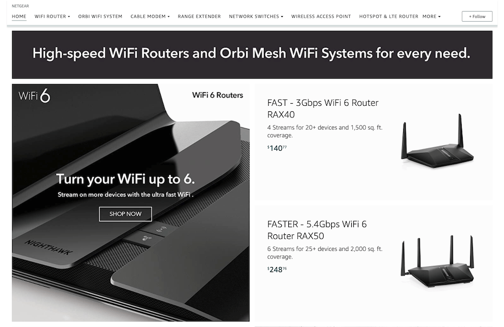
Netgear offers technology-related products. It has the best Amazon storefronts by displaying a wide range by adding complete information about the products.
They have embedded images showing the usage of the products and how one’s life is affected by using their products. The color palette is white and black.
The best feature about this store is that they have used the current pandemic in marketing their products. For instance, they used phrases like, “Work from office at office speed,” “Study Online.” These tactics help in increasing sales by addressing buyers’ needs.
Also, store tabs help buyers search for specific products.
Amazon Brand Store #2: Beats
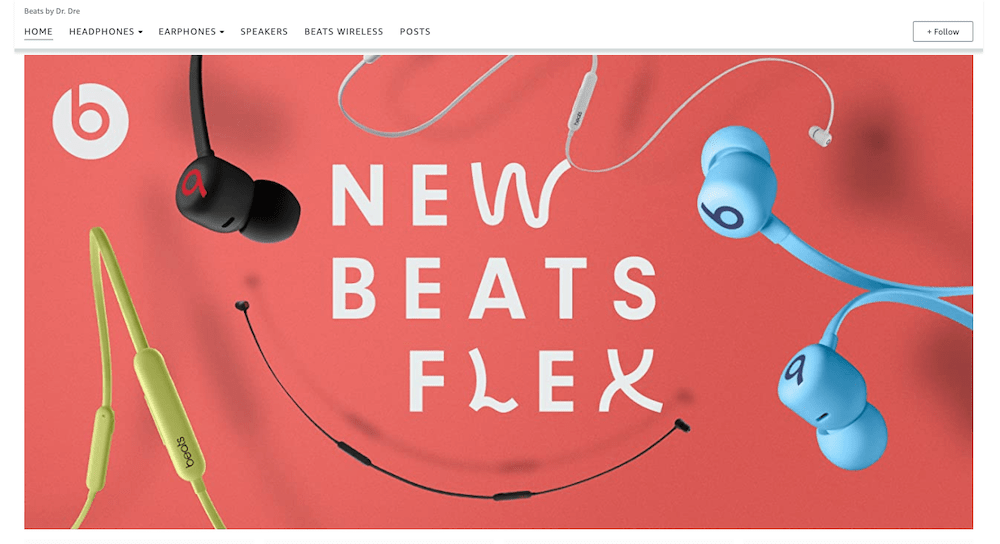
Beats has the best Amazon brand storefront because of the way of the product placement and images used. The company offers headphones, earphones, speakers, and wireless with different designs, features, and prices.
Beats displays its best products on the homepage of the store. For each product, the images are shared, reflecting how and when customers can use the specific type of the products.
Additionally, in each image, critical features of the products are added, such as battery timing, connectivity, and controlling system.
For instance, people can use the Beats Pro during exercising as it is a wireless device; dancers or DJs can use the New Beats flex. They have used different colors in their storefront and highlighted the text in it. It has targeted a broad target market, which you notice by seeing the marketing images.
Amazon Brand Store #3: Apple
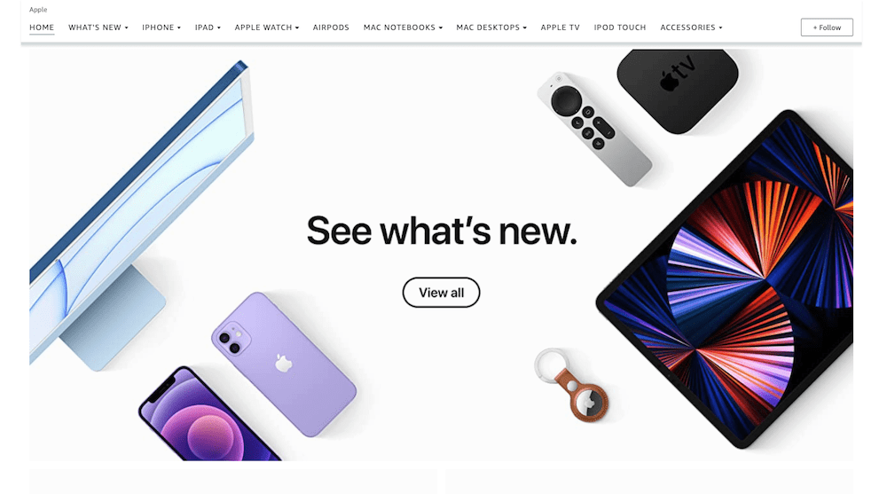
Apple is an international brand, known through the brand’s icon globally. The color theme of the Apple brand store at Amazon is similar to its official website.
The company uses the minimum space to display the product and keeps whitespace for highlighting it. The homepage of the apple Amazon brand store displays broader categories of its product collection, which directs to the next page of the store.
This store has the best Amazon storefront because it highlighted its model and features by adding text in large and bold font.
Then, the prices of the product displayed below the product’s image in a smaller font. It shows that price is not of that much value for Apple’s consumers as the features and model. The brand store highlights the critical elements of the products with less text, unlike other stores.
Amazon Brand Store #4: Malibu C
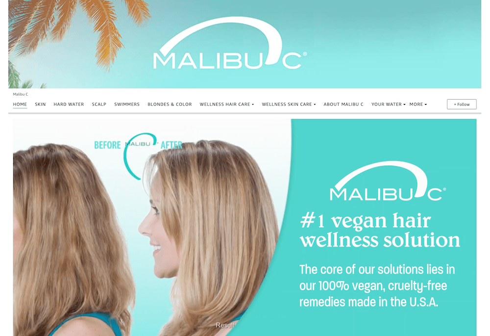
Malibu C offers beauty-related products related to skin and hair. It is one of the best Amazon storefronts because they have used their best product at the front display.
On their page, you’ll notice a short video on the #1 vegan hair wellness solution along with the description of the product’s benefits. Followed by the video, the storefront includes four key elements (eco-friendly, cruelty-free, vegan, plant-based) of Malibu C’s products, which make it stand out unique from others.
The color palette selected is also eye-catching with warm colors.
After this, it displays different products with some features and their prices.
Malibu C’s Amazon store is different from others because it focused more on displaying its products instead of having model pictures.
From the storefront, you can see that they emphasize the problems customers encounter and how using their products can solve many of them.
Amazon Brand Store #5: MARS WRIGLEY
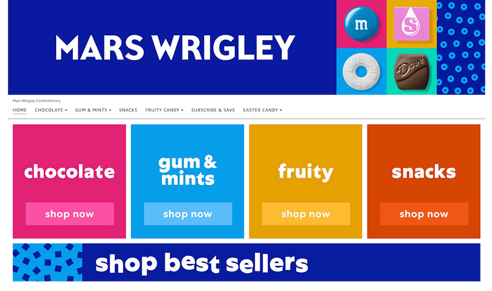
MARS WRIGLEY, a confectionary brand, features warm colors, which are eye-catching and appealing based on its target market. It has used dark blue, yellow, mustard, and pink color combinations, which gives a vibrant look to the store.
It has the best Amazon storefront because the consumers are mainly kids attracted to the colors used in the store theme.
The theme highlights the nature of the product. It offers four broader categories of products with different types and is displayed after navigating through the storefront.
The store’s homepage provides best-sellers products with simple and small descriptions of the product and their prices. The space of stores mostly displays the products with few images of marketing the products.
Best Amazon Stores #6: Indo Board
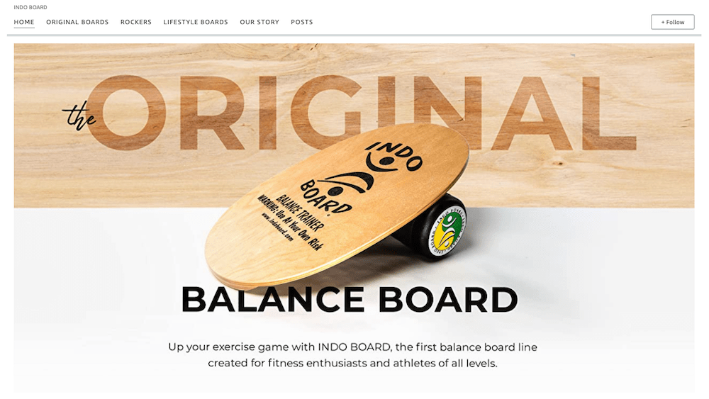
Indo Board offers the first balanced board line created for athletes and enthusiasts of all levels and age groups. The one single product arrives in different designs, which you can use for creating the categories at the Amazon storefront.
It has the best Amazon storefront based on how it has used a combination of images and videos to show how a customer could use the products in different ways to maintain fitness.
The color themes are fresh and bright, which attract the attention of the viewers.
Where needed, use whitespace for adding text to motivate you to buy the products and highlight the features of the products. The storefront has the brand’s history and shows the value it has added to society. Overall, it has less text and more images to display.
Amazon Brand Store #7: Clarks
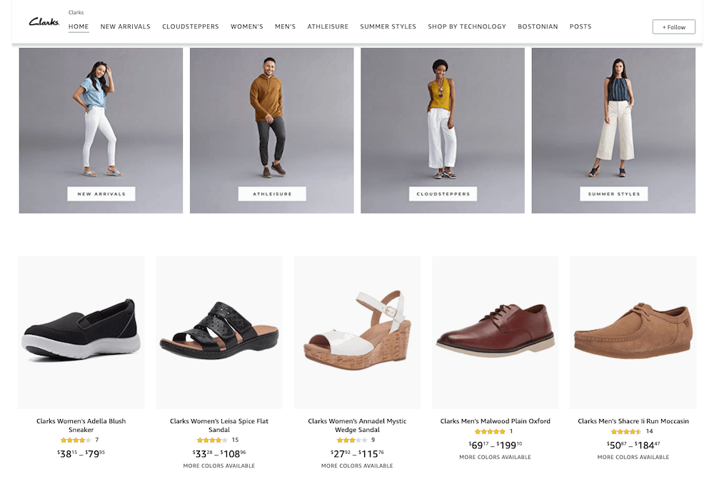
Clarks offers men and women footwear varying from high-fashion wears to technologically manufactured health-related ones. The color palette of the store is white and grey, displaying a simple color theme.
The Amazon store presents the wide range of collections available at Clarks by displaying the products and their prices. There are tabs on the storefront, which eases the navigation across the store to search for specific types of footwear.
The storefront is attractive; with a few images of models wearing Clarks’ collection, the store mainly provides details of its catalog.
Amazon Brand Store #8: Verilux
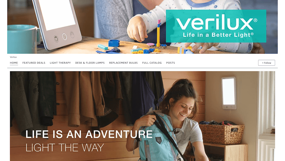
Verilux offers healthy lighting products and has one of the best Amazon stores. Its Amazon storefront has numerous informative images. They show the ways customers could use the products in day-to-day routines.
They have a limited range of products but have been categorized, emphasizing how each product is essential.
The product’s nature matches the white color theme of the Amazon brand store. Furthermore, whitespace is used by adding texts to grab the attention of viewers.
It is the best Amazon storefront 2021 because the focus is on how customers can use these products instead of displaying the products and their prices.
Unlike others, though, the home page does not have a complete list of products.
Best Amazon Stores #9: PackIt
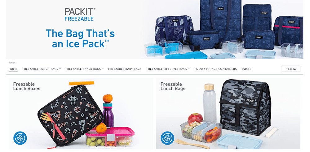
PackIt offers an innovative product for packing food items for different purposes. The storefront highlights relevant and essential information about its products.
They use images and videos, which demonstrate brand authority and show how customers can use the products. The features of the products are highlighted. The storefront does not have a price for a single item. On clicking shop now, it directs the visitor to the buying page.
Overall, stores highlight different designs and shapes of PackIt’s collection. The way PackIt shares information and highlights product usability motivates viewers to buy.
The storefronts of Amazon stores are similar to the store outlook of any physical store in your surroundings. If you want your visitor to become a buyer, give them a reason to explore your store by using better images and messages.
These 9 Amazon stores have a few things in common such as creating tabs for categorizing their products and quickly finding the desired effect; using whitespace for highlighting important information. Besides, each of them has used the themes and layout differently, which associates with the product’s nature they offer.
These 9 Amazon stores have a few things in common such as creating tabs for categorizing their products and easily finding the desired product; using whitespace for highlighting important information. Besides, each of them has used the themes and layout differently, which associates with the product’s nature they offer.
