
Great design isn’t enough to drive sales. If your Amazon A+ Content looks polished but isn’t converting, it’s likely missing the mark on clarity, mobile optimization, or actionable messaging. Shoppers want quick, useful details – not just pretty visuals. Here’s what might be going wrong:
- Cluttered visuals: Overloading with images or decorative elements confuses shoppers and buries key product benefits.
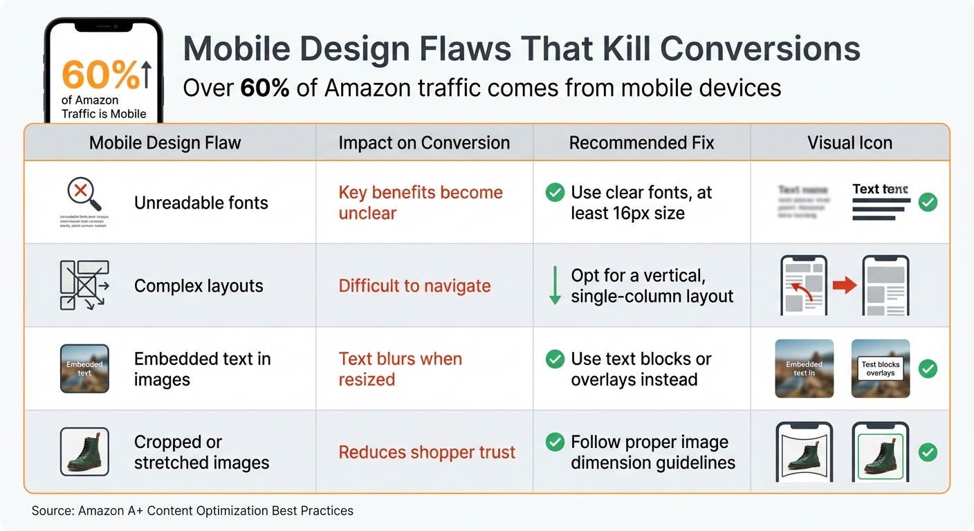
- Poor mobile experience: Over 60% of Amazon traffic comes from mobile. Tiny fonts, broken layouts, or unreadable text in images can ruin the experience.
- Hidden value: Shoppers skim for benefits and reasons to buy. If your content is vague or overly technical, they’ll move on.
To fix this, balance strong visuals with clear, scannable text, and prioritize mobile-friendly design. Use bullet points, readable fonts, and comparison charts to highlight benefits. Test and update content regularly to stay competitive. Remember: A+ Content should guide shoppers to click "Add to Cart", not just look good.
Follow these examples to maximize conversion rate with A+ content
How Over-Designed A+ Content Reduces Add-to-Cart Rates
Mobile A+ Content Design Flaws and Fixes for Amazon Sellers
Too Many Visual Elements Create Confusion
Striking the right balance between visual appeal and clear messaging is essential. When A+ Content is overloaded with decorative visuals, it can overwhelm shoppers, making it hard for them to focus. This "visual clutter" often leads to cognitive overload, causing potential buyers to scroll past without making a purchase.
A PickFu study on Everyman Jack’s deodorant listing highlighted this issue. The listing featured an eye-catching hero image that ended up distracting rather than informing shoppers. The design, while visually striking, lacked clear benefit-driven messaging. For instance, the tagline "naturally derived, outdoor inspired" was too vague for shoppers, who wanted more specific details about the product’s scent and ingredients instead of lifestyle imagery.
Poor Mobile Display
With over 60% of Amazon traffic coming from mobile devices, A+ Content that isn’t optimized for smaller screens can significantly hurt conversions. Designs that look sleek on a large desktop monitor often become chaotic on a smartphone’s 6-inch screen.
Mobile users frequently face issues such as fonts that are too small to read, images that appear cropped or stretched, and layouts that break apart on narrower screens. For example, text smaller than 16px can be difficult to read on mobile devices. Additionally, embedding critical information into images can backfire, as those images might become blurry or unreadable when resized for smaller displays.
| Mobile Design Flaw | Impact on Conversion | Recommended Fix |
|---|---|---|
| Unreadable fonts | Key benefits become unclear | Use clear fonts, at least 16px size |
| Complex layouts | Difficult to navigate | Opt for a vertical, single-column layout |
| Embedded text in images | Text blurs when resized | Use text blocks or overlays instead |
| Cropped or stretched images | Reduces shopper trust | Follow proper image dimension guidelines |
These mobile display problems don’t just make content harder to read – they also obscure the product’s key benefits and calls-to-action, which are crucial for conversions.
Hidden Benefits and Calls-to-Action
In addition to cluttered visuals and poor mobile design, hiding key benefits can seriously hurt your conversion rates. Amazon shoppers tend to skim listings, looking for quick, clear reasons to buy. If they have to dig for information or can’t immediately see why your product stands out, they’re likely to leave and check out a competitor’s listing instead.
A split test conducted by SupplyKick for its brand partner ciao! baby found that static content showcasing all key benefits upfront outperformed interactive modules that required additional clicks.
Another common pitfall is focusing too heavily on technical specifications rather than explaining how the product can improve the shopper’s life. Shoppers care more about practical benefits than technical jargon. When these real-world benefits are buried or unclear, it becomes much harder to drive conversions.
Common Design Mistakes in A+ Content
Beyond overly elaborate layouts, sellers often make other design missteps that can hurt conversions.
Too Many Images and Graphics
It’s tempting to pack A+ Content with eye-catching images, but decorative visuals often fail to communicate what the product actually does. Heatmap studies show an interesting trend: while "hero" lifestyle images – like a model using the product – grab attention, they rarely lead to clicks if they don’t highlight specific benefits. Shoppers may glance at these images, find little of value, and scroll right past them.
This overload of visuals can lead to cognitive fatigue. If customers have to sift through layers of graphics just to understand how your product helps them, they’re likely to leave the page altogether. And while cluttered visuals are problematic, they’re not the only issue.
Text That’s Hard to Read
Readable text is non-negotiable, yet many sellers fall into the trap of using low-contrast colors or fonts that are too small – especially on mobile devices. Fonts smaller than 16px or light-colored text over busy backgrounds are particularly common offenders. Another frequent mistake is embedding text directly into images. While this might look fine on a desktop, it often becomes blurry or unreadable on a smartphone. Shoppers shouldn’t have to squint or zoom in just to figure out what you’re offering. If your content isn’t easy to skim, many buyers will simply move on to another listing.
Unclear Value Propositions
Even if your visuals and text are on point, unclear messaging can still drive shoppers away. Phrases like "naturally derived" or "premium quality" might sound appealing, but they don’t explain why your product is better than others. Shoppers often dismiss this kind of vague language as "word salad" – empty phrases that fail to provide meaningful information. The problem gets worse when sellers focus too much on technical specs instead of showing how the product improves the customer’s life.
"People don’t buy products. They buy trust." – Seth Godin
When your value proposition isn’t immediately obvious, you’re asking shoppers to put in extra effort to figure out if your product meets their needs. Most won’t bother – they’ll just move on to a listing that clearly communicates its benefits.
How to Balance Design with Conversion Performance
Striking the right balance between eye-catching design and conversion-focused content is essential. Overloading your content with too much design flair can actually hurt your results. The goal? Combine visual appeal with messaging that drives action. Here’s how to merge aesthetics and performance seamlessly.
Use Scannable Text and Bullet Points
Keep text short and to the point – 30 to 40 words per module is ideal for quick scanning. Think about how shoppers behave on platforms like Amazon: they skim rather than read every word. Highlight the most important benefits with bullet points, and when you need to include technical details (like dimensions or battery types), rely on Amazon’s specifications module instead of squeezing everything into an image. This not only makes your content easier to digest but also helps Amazon’s algorithm pick up on your keywords.
"Write for skimmers by using bold key phrases and keeping text blocks short." – Francisco Valadez, VP of Brand Operations, My Amazon Guy
Place Visual Modules Where They Work Best
The placement of your visual modules is just as important as the content itself. Your first module is prime real estate – it gets the most attention and clicks. Use this space wisely with a full-width hero banner that shows your product in action, emphasizing its main benefit. From there, organize your modules in a logical flow: start with the hero banner, follow with icons and captions, then add lifestyle images and comparison charts. Save detailed sections like specifications and Q&A for the end, where more detail-oriented shoppers can find them.
Add Interactive Features
Interactive elements can take your design to the next level while boosting conversions. If you’re eligible for Premium A+ Content, incorporating video is a game-changer – video content can improve conversions by 3.6X compared to static images. Short, focused demos are especially effective for showcasing solutions to common problems. Interactive hotspots are another great tool, allowing you to highlight specific features – like pointing out "breathable mesh" on a shoe – without cluttering your main visuals. Additionally, Q&A sections can address common concerns, easing buyer hesitation and cutting down on returns.
sbb-itb-e2944f4
How Emplicit Optimizes Amazon A+ Content

Emplicit uses a data-driven approach to create Amazon A+ Content that enhances conversions. By prioritizing mobile-friendly design, they ensure content is easy to read and visually appealing on any device. They also make sure essential details are presented as selectable text, avoiding the common pitfalls of embedding text in images.
Custom Conversion Strategies
Emplicit crafts customized strategies for every brand. They use tools like Amazon’s "Manage Your Experiments" and PickFu to test different designs, copy, and layouts, often increasing sales by 20% to 25%. The team also dives into customer feedback and FAQs to uncover common concerns – whether about sizing, materials, or compatibility – and addresses them directly within A+ modules to reduce friction during the shopping experience.
SEO is seamlessly integrated into every module. Instead of relying on image-based text, Emplicit creates keyword-rich, crawlable copy, taking full advantage of Amazon’s ability to index A+ Content. They also optimize image alt-text (up to 100 characters) with relevant keywords, boosting visibility on both Google and Amazon’s internal image search. To make product comparisons easier for shoppers, Emplicit includes detailed comparison charts that highlight key product differences and guide customers to other items in the brand’s catalog, helping streamline decision-making.
These tailored strategies work hand-in-hand with Emplicit’s broader marketplace services to maximize results.
Complete Marketplace Management Services
Emplicit doesn’t stop at optimizing A+ Content – they offer full-service marketplace management to drive even greater sales. Their services include aligning advertising campaigns, managing inventory, and ensuring account stability. By connecting A+ Content optimization with PPC strategies, listing improvements, inventory tracking, and account health monitoring, they create a cohesive approach that supports long-term growth.
With U.S.-based account managers and customized strategies, Emplicit handles the technical challenges of selling on platforms like Amazon, Walmart, Target, and TikTok Shops. This allows brands to focus on scaling their business while Emplicit ensures everything runs smoothly behind the scenes.
Measuring and Improving A+ Content Performance
Creating visually appealing A+ Content is just the start. What really matters is whether it drives customer actions, like adding products to their cart. That’s where data comes in – it helps validate your design choices and shows how your content impacts customer engagement and sales.
Key Performance Metrics to Track
One of the most important metrics to watch is Unit Session Percentage, which measures how many visitors make a purchase after viewing your A+ Content. According to Amazon, Premium A+ Content can boost sales by up to 20%, while Basic A+ Content typically results in an 8% increase. If your numbers fall below these benchmarks, it might indicate that your design isn’t resonating with customers. Regularly comparing this data with historical performance can help you spot trends or areas that need improvement.
Another critical metric is the Return Rate. High return rates could mean your visuals are misleading or your copy isn’t addressing key customer questions. On the flip side, a low return rate suggests that your content is setting accurate expectations and answering customer concerns effectively.
Metrics like Session Time and Click-Through Rate (CTR) can also reveal how engaging your content is. If customers aren’t clicking on your comparison charts or spending time exploring your content, they might be confused or uninterested. These metrics can help you identify what’s working and what needs adjustment.
Make it a habit to track these metrics monthly through Amazon Seller Central. Compare them against your baseline data from before you implemented A+ Content to understand its true impact.
A/B Testing and Content Updates
Once you’re monitoring the right metrics, the next step is testing and refining your content. Amazon’s "Manage Your Experiments" tool allows you to run A/B tests, comparing two versions of your A+ Content side by side. To get clear results, focus on testing just one element at a time – whether it’s a hero banner, module order, or a comparison chart.
"Don’t test multiple variables at once. Otherwise, you won’t know what change actually made a difference."
- Francisco Valadez, VP of Brand Operations, My Amazon Guy
Run your tests for 8–10 weeks and aim for a 90% significance level before deciding which version performs better. Avoid running tests during high-traffic periods like Prime Day or the holiday season, as these events can distort your data.
It’s also important to update your content every 3–6 months. Customer preferences shift, competitors improve their listings, and seasonal trends can change what shoppers are looking for. Regular updates help you stay relevant and address new questions or concerns raised in customer reviews and FAQs.
For quick feedback before committing to a full A/B test, tools like PickFu can be incredibly useful. They provide heatmaps and click tests to show which elements grab attention and which ones are ignored. These insights can guide you in refining your content to make it more effective.
Conclusion
A+ Content isn’t just about looking good – it needs to convert to drive sales. Striking the right balance between eye-catching visuals and clear, scannable text that speaks to shoppers’ needs is the secret sauce. And don’t forget mobile! A design that doesn’t work seamlessly on mobile devices risks losing a significant chunk of potential buyers. In short, combining design and functionality is the key to turning browsers into buyers.
Some of the most common design pitfalls – like embedding text in images, overloading modules with too many graphics, or burying your value proposition – are surprisingly easy to fix once you know what to watch for. Focus on scannability with short, digestible paragraphs and bold key phrases. Use tools like comparison charts to keep shoppers engaged with your brand, and make sure every module serves a purpose by addressing specific customer questions or concerns. When done right, a conversion-focused design can make all the difference.
Emplicit specializes in helping brands take their Amazon A+ Content to the next level. They craft custom strategies that maximize the potential of all seven modules, run data-driven A/B tests, and tweak content based on real customer behavior to ensure continuous improvement.
The most successful brands know how to blend captivating design with persuasive messaging. They deeply understand their customers, tackle objections directly, and make the buying process as simple as clicking "Add to Cart." Your A+ Content should do the same.
FAQs
How can I make sure my Amazon A+ Content works well on mobile devices?
To make your Amazon A+ Content work seamlessly on mobile devices, focus on crafting a user-friendly experience for smartphone users. Start by using Amazon’s mobile layout tool to preview your content. This helps you ensure proper spacing, image scaling, and overall readability. Use high-resolution images under 1 MB to keep loading times fast, and overlay short, clear text on visuals rather than embedding text directly into the images.
Stick to a clean design with single-column layouts, large, touch-friendly buttons, and fonts that are at least 16px for easy reading. Avoid cluttering images with excessive text; instead, use separate text modules for detailed descriptions. For the best results, test your content on actual devices, like an iPhone or Samsung Galaxy, to make sure it looks sharp and functions well on smaller screens. A thoughtful balance of simplicity and usability can help create mobile-friendly content that boosts conversions.
What are the essential elements for creating effective Amazon A+ Content?
Effective Amazon A+ Content combines visually appealing elements with clear, persuasive information to guide shoppers. To make your content stand out, focus on these essentials:
- High-quality lifestyle images: Show your product in action and pair it with short, impactful text overlays to emphasize key benefits.
- Benefit-driven copy: Keep the text concise and focused on what matters most to the buyer, while using visuals to reinforce your message.
- Straightforward technical details: Use tables or bullet points to present features like size, fit, or functionality, helping shoppers quickly verify if the product meets their needs.
- Brand storytelling: Share your brand’s mission or the inspiration behind the product to create an emotional connection with your audience.
- Comparison charts: Highlight how your product stacks up against competitors, making it easier for customers to see its advantages.
When you combine these strategies, your A+ Content won’t just look polished – it will also guide shoppers toward making a confident purchase decision.
How often should I update my Amazon A+ Content to maximize sales?
Keeping your Amazon A+ Content sharp and effective means giving it regular updates. Think about revisiting your content whenever you roll out new products, tweak your branding, or observe a drop in conversions.
It’s also a good idea to review your A+ Content every few months. This helps you stay in sync with shifting customer preferences, seasonal trends, and any updates to Amazon’s guidelines. Consistent updates not only keep your content relevant but also boost engagement and encourage more shoppers to hit that "Add to Cart" button.
Related Blog Posts
- Your Competitor’s Ugly Amazon Listing Is Outselling Yours. Here’s the Uncomfortable Truth.
- The Amazon Listing That Sold $1.2M in Dog Supplements Last Year Had One Thing Yours Doesn’t
- Why the Fastest-Growing Pet Brands on Amazon Are Spending Less on Ads, Not More
- Amazon Ads Are a Tax on Weak Listings. Here’s How to Stop Paying It.