

A product page wins or loses the sale in seconds. If I had to boil this article down to one point, it’s this: pages convert better when they answer the buyer’s next question in the right order.
Here’s the short version:
- Title: say what the product is right away
- Images and video: show the product fast and clearly
- Copy: explain the result, not just the feature
- Price: show full cost, savings, shipping, and delivery timing
- CTA: make the next step easy to see and easy to tap
- Reviews and UGC: give proof from other buyers
- Trust cues: put returns, shipping, and checkout signals near the button
- Specs and variants: help people confirm fit, size, or compatibility
- Cross-sells: show a small set of add-ons after the main choice is made
A few numbers stand out. Shoppers spend 65% of product-page time on images. Hidden fees drive 48% of cart abandonment. Products with reviews can convert at 270% of the rate of products with none. And mobile pages often do better when the Add to Cart button stays in view.
That means I’d focus less on adding more page blocks and more on fixing friction. Clear titles, strong visuals, plain pricing, visible CTAs, and proof near the buy button do most of the work.
| Element | What it needs to answer |
|---|---|
| Title | What is this? |
| Visuals | What does it look like? |
| Copy | Why should I care? |
| Price | Is it worth $X.XX? |
| CTA | What do I do now? |
| Reviews | Do other people like it? |
| Trust cues | Is it safe to buy? |
| Specs/variants | Will it fit my needs? |
| Cross-sells | Do I need anything else? |
If I were improving a product page, I’d start with the part tied to the biggest leak: high bounce rate, weak add-to-cart rate, or heavy cart abandonment. Then I’d test one change at a time.
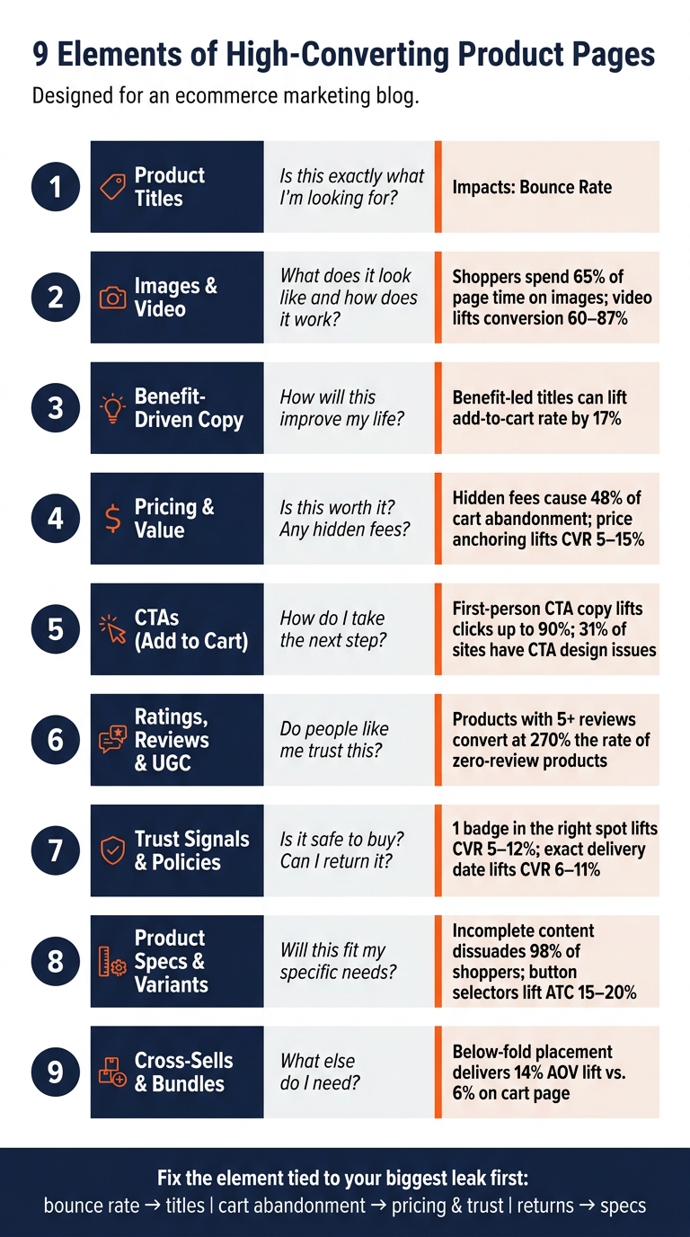
9 Elements of High-Converting Product Pages (With Key Stats)
Ultimate Guide to Product Page Conversion Rate Optimization (CRO) 🔥
sbb-itb-e2944f4
Why Product Page Layout Affects Conversion Rate
A product page is where people make the call to buy or walk away. Every layout choice pushes that decision forward or gets in the way. Put simply, layout shapes how each part of the page does its job. And that matters because shoppers don’t read product pages line by line. They skim, scan, and jump to what stands out.
That means the image, price, and CTA need to get attention fast. Those are the first things most people look for. On mobile, this matters even more. Screen space is tight, so weak page structure can hide key details or make the next step feel harder than it should.
Top-performing stores hit 4% to 8% conversion by improving layout and technical performance. At the same time, mobile brings in most traffic but far fewer sales. So when product details are buried, or when the page adds friction, conversion takes a hit.
Trust signals near the "Add to Cart" button help answer doubts right when shoppers are about to act. A sticky CTA that stays visible while someone scrolls can lift mobile conversion. Layout doesn’t just change how a page looks. It changes how much money that page makes. The first place to put that structure to work is the product title.
1. Clear, Intent-Matching Product Titles
Your product title needs to confirm relevance right away. Shoppers look at titles first, so the title has to do fast, direct work. It’s the first relevance check, especially on mobile and marketplace listings. Internal product names that shoppers don’t know can hurt conversions. A title like "Aurora 3" says almost nothing. "Wireless Noise-Cancelling Over-Ear Headphones" tells shoppers exactly what they’re looking at in seconds.
For marketplace listings, use a clear formula: [Brand] + [Product Name] + [Key Feature/Use Case] + [Size/Color/Variant]. For DTC pages, pair the title with a short subhead that points to the problem or result. Lead with the outcome, not the feature. "Softer skin in 48 hours" works better than "Hydrating Face Cream." Benefit-led titles tend to beat feature-led titles, especially with shoppers who are new to the brand.
A few rules help here:
- Keep titles short
- Put key terms near the front
- Stay under 60 characters to avoid truncation on mobile and in search
Once the title sets the expectation, the image needs to back it up at a glance.
2. High-Quality Images and Video
Shoppers spend 65% of product-page time on images, which means the gallery does a huge share of the selling. It needs to back up the promise in the title before someone even starts to scroll.
A smart flow looks like this: start with a lifestyle hero shot, then move into detail shots, a scale reference, and UGC. That order helps shoppers figure out fit, size, and quality faster. And it can lift add-to-cart rates by 15–30%.
Once the gallery shows what the product is, video shows how it fits into real life. Keep clips between 15–60 seconds. Set them to autoplay muted and loop in the gallery, and make sure they show the product in use. Product video can lift conversion by 60–87% and cut returns in apparel and home goods by 18%.
A few technical details matter here too:
- Use images that are at least 2,000×2,000 pixels
- Compress them to WebP
- Keep file sizes under 200 KB
Layout also changes how people use the page. On mobile, a swipeable carousel with dot indicators works well because it keeps the CTA in view. On desktop, the main image or video should fill at least half the viewport so the product stays front and center.
Once the visuals answer the first question, the description should explain the payoff.
3. Benefit-Driven Bullet Points and Descriptions
Once the visuals have done their part, the copy needs to answer one thing fast: Is this for me? That’s why the first screen should move from feature to benefit to outcome.
Don’t just describe what the product is. Explain what it does for the buyer. “10-hour battery life” is a feature. “Full workday on one charge” is a benefit. “Travel or commute without carrying a charger” is the outcome that helps sell the product, so that’s the version to put above the fold.
Keep above-the-fold bullets to 3–5 points. Each one should connect a feature to a buyer result. Phrases like “which means” or “so you can” make that connection plain.
"10-hour battery life"
"Full workday on one charge"
"Travel or commute without carrying a charger"
In 2025, Caraway Home tested “The Pan That Replaces Your Whole Drawer” against “Saute Pan” and saw a 17% lift in add-to-cart rate. That tells you a lot. The aim isn’t to make people read more. It’s to make the buying choice feel obvious.
A simple layout works well here:
- Put the core benefit right under the title
- Follow it with 3–5 bullets
- Move the full description into a collapsible accordion
- On desktop, add a short 150–300 word narrative for shoppers who are close to buying
The bullets should back up the title and CTA, not fight for attention.
Once the copy clears up “Is this for me?”, pricing has to show the value makes sense.
4. Clear Pricing and Value Messaging
Once the copy answers “Is this for me?”, pricing has to answer “Is this worth it?”.
That means showing price and value before doubt creeps in.
Put the full cost above the fold: the current price, savings, shipping cost or free-shipping threshold, and an estimated delivery date. A specific delivery date does more to cut uncertainty than a vague shipping window. Unexpected fees drive 48% of cart abandonment.
A few pricing cues can also help people make sense of the offer fast. Show the original price crossed out next to the sale price. That kind of price anchoring can lift conversion rates by 5% to 15% compared to showing only the final price. For bundles, frame the offer by unit price, like "$3.25 per meal" instead of leading with the full total. And when average order value is above $75, showing Buy Now, Pay Later installments right on the product page, such as "4 payments of $25," can lift add-to-cart rates by 8% to 12%.
On mobile, keep the price, savings, and delivery details visible above the fold. On DTC pages, pricing should back up the value the copy has already built.
Once the price feels justified, the next step should be unmistakable.
5. Add to Cart and Buy Now CTAs
Once the price makes sense, the CTA needs to make the next move feel obvious. Then placement does the heavy lifting.
Put the main CTA above the fold, right next to the price and variant picker on desktop. On mobile, place it in the lower part of the screen where it’s easy to tap. The tap area should be at least 48px high.
If the page runs past the fold, don’t make people hunt for the button again. Keep the action in view while they scroll. A sticky CTA works well here: a bottom bar on mobile and a sidebar on desktop. Just make sure it stays synced with the selected variant.
Button copy and design matter more than most brands think. The add-to-cart button should use a solid, high-contrast color so it gets the most visual attention on the page. Save outline buttons for secondary actions like "Add to Wishlist." As Faisal Hourani notes, 31% of ecommerce sites have CTA design issues that reduce clicks. First-person phrasing like "Add to my cart" can lift clicks by up to 90%.
Add a short reassurance line right above or below the button. The goal is simple: clear the shopper’s hesitation on the spot.
6. Ratings, Reviews, and User-Generated Content
After the CTA, shoppers want proof that they’re making the right call. That’s where reviews do a lot of heavy lifting. Products with at least five reviews convert at 270% the rate of products with zero reviews. And for items priced at $100 or more, that lift climbs to 380%.
Put the star rating and review count right below the product title. Then make the rating clickable so it jumps users straight to the full review section. It’s a small detail, but it removes friction. You should also place a short review excerpt near the CTA, right where hesitation tends to show up. On mobile, don’t bury reviews inside tabs. Keep the full review block lower on the page, but still easy to reach. Once shoppers trust the rating, the review detail and UGC help clear the last bit of doubt.
A 4.6-star rating from 3,000 reviews often feels more trustworthy than a 5.0 from 12. Why? Volume matters. Shoppers don’t just look for praise. They look for answers. Reviews that deal with clear concerns, like fit, skin sensitivity, durability, size, and performance, tend to persuade more than broad compliments. It also helps to show a mix of feedback, including the occasional negative review, because that feels more believable. And when a brand replies to a one-star review in a calm, solution-focused way, it can ease doubt even more by showing the company stands behind the product.
For visual proof, use customer photos and videos. UGC helps people see fit, texture, and how the product looks in everyday use. Adding customer photos to a product page can drive a 20–30% conversion lift, and UGC videos beat professional brand videos by 22% in conversion tests. For apparel and home goods, UGC in the media gallery can also help cut return rates by showing shoppers exactly what they’ll get.
Keep the full UGC gallery and full review block below the fold. Near the top, show only one or two strong review excerpts that handle common objections. That gives shoppers the proof they need without cluttering the decision zone.
7. Trust Signals, Return Policies, and Shipping Details
Reviews help people feel better about a product. Trust cues help them click Add to Cart.
That’s why placement matters so much. Put trust cues right beside the CTA, where last-second doubt tends to show up. A small set of 2–4 badges works well, such as "Secure Checkout", "30-Day Returns," and "Free Shipping." One badge in the right spot can lift conversions by 5–12%.
Return policies should be just as easy to see. Add a short refund promise near the CTA in plain language to cut hesitation. For example:
"Try it for 30 days – if you don’t feel a difference, we’ll refund every penny".
Shipping details matter too. On desktop, place trust badges and shipping info beside the CTA. On mobile, keep them tight: use small icons or add them to a sticky Add to Cart bar so the price and trust cues stay in view while people scroll.
And here’s a simple upgrade that can make a big difference: swap vague shipping windows for exact delivery dates when you can. Showing "Arrives by Thursday" can lift conversions by 6–11%.
Once trust is clear, shoppers need specs and variants to confirm fit.
8. Product Specs and Variant Selection
After price and trust, specs and variants answer the last buying questions. This is the part that helps people confirm fit, compatibility, and which option to pick. If that info is missing, people back out fast: incomplete content dissuades 98% of shoppers from buying.
Variant selectors should sit above the fold so shoppers can choose size, color, or model right away, without scrolling. And the format matters. Use swatches or buttons instead of text dropdowns. When brands swap dropdowns for buttons, add-to-cart rates can jump by 15–20%. On mobile, touch targets should be at least 44×44 pixels. If a button is too small to tap without zooming in, that’s a problem.
When someone picks a variant, the hero image should update on its own to match that choice. This sounds small, but it matters. If a shopper selects "Forest Green" and still sees a red product image, doubt creeps in. Dynamic image updates help the page feel clear and dependable.
Technical specs need the same level of care. Include dimensions, weight, materials, care instructions, and compatibility details. On mobile, put this information below the fold in collapsible accordion sections. That keeps the page clean without hiding the facts people need. Marketplaces usually require structured tables, while DTC pages can present the same details in accordions or tabs.
Out-of-stock variants should stay visible, but disabled, instead of disappearing. Pair that with a "Notify Me" option for restock alerts. Hiding an option can make shoppers think it never existed. Leaving it visible shows the full assortment and makes the stock issue easy to understand.
Once specs and variants are clear, the page can surface related items that fit the same need.
9. Cross-Sells, Bundles, and Related Product Recommendations
Once a shopper picks a variant, it’s a good time to show products that go with it. Put cross-sells below the fold – after the product description, but before the reviews section. That spot delivers an average 14% lift in AOV, compared with just 6% when the same recommendations show up on the cart page. The logic is simple: wait until the main product choice is settled, then offer a few add-ons that make sense.
Keep the set tight and easy to scan. Show only the most relevant add-ons, and limit the module to 2–4 items with a thumbnail, price, and product name. Too many choices can slow people down.
Bundles need to feel easy. Use one "Add Both to Cart" button to cut friction. And if you’re deciding between hand-picked bundles and data-driven ones, the numbers lean one way: algorithmic bundling based on actual purchase co-occurrence data beats manual curation by 23%.
Layout matters too, especially across devices:
- On mobile, place recommendations below the sticky CTA and use swipeable carousels.
- On desktop, use a 4-column grid and place related products at the bottom.
- Lazy-load recommendation modules to protect page speed.
Summary Table of the 9 Elements
Every element on a product page answers a shopper’s question.
That matters because high-converting product pages move people from discovery to purchase with less hesitation. Each element clears a different snag in the buying path.
| # | Element | Shopper Concern | Main Metric Affected |
|---|---|---|---|
| 1 | Product Titles | "Is this exactly what I’m looking for?" | Bounce Rate |
| 2 | Images & Video | "What does it look like and how does it work?" | Conversion Rate |
| 3 | Benefit-Driven Copy | "How will this improve my life?" | Conversion Rate |
| 4 | Pricing & Value | "Is this worth it? Are there hidden fees?" | Cart Abandonment Rate |
| 5 | CTAs (Add to Cart) | "How do I take the next step?" | Add-to-Cart Rate |
| 6 | Ratings, Reviews & UGC | "Do people like me trust this product?" | Conversion Rate |
| 7 | Trust Signals & Policies | "Is it safe to buy? Can I return it?" | Cart Abandonment Rate |
| 8 | Product Specs & Variant Selection | "Will this fit me or my specific needs?" | Return Rate |
| 9 | Cross-Sells & Bundles | "What else do I need to buy?" | Average Order Value (AOV) |
The metric column helps you find the page element causing the most friction first.
For example, if bounce rate is high, start with Product Titles. If cart abandonment is the bigger problem, look at Pricing & Value and Trust Signals & Policies before anything else.
Use this table to rank fixes by impact before moving into category-specific priorities. Then adjust by category, because apparel, beauty, and home goods don’t need the same fixes first.
How to Prioritize Improvements by Product Category
Not every product page element matters the same way in every category. Use the summary table above as your starting point. Then, fix the ONE thing that removes the biggest point of friction for that category first. After that, layer in the rest.
Apparel should start with sizing and fit. This category has the highest return rate in U.S. ecommerce, landing between 30% and 40%, and fit is the main reason people send items back. That’s why context-sensitive sizing guides matter so much. A leggings guide shouldn’t look the same as a shorts guide. Add lifestyle UGC next so shoppers can see how the item looks and moves in day-to-day use.
Electronics shoppers want hard details. Start with clear specs and a short demo that shows the product in action. For products people compare side by side, studio images help. And for higher-ticket items, put warranty information close to the CTA. It works as a key trust signal at the moment someone is deciding whether to buy.
Beauty shoppers are buying a result, not just a product. Lead with benefit-focused copy, clinical proof, and texture images that show how the product behaves on skin.
Home Goods pages need to reduce uncertainty around size and placement. Start with scale images and sensory copy that helps people picture the item in a room, understand its dimensions, and get a feel for the material or finish.
Grocery is more direct. Lead with unit price and sensory copy. For comparison shopping, unit price is the strongest value cue.
If time or budget is tight, use this table to choose the first fix:
| Category | Lead With | Why |
|---|---|---|
| Apparel | Sizing/fit guides + lifestyle UGC | Fit uncertainty drives 30%–40% return rates |
| Electronics | Spec clarity + functional demo | Buyers need data and to see the product working |
| Beauty | Benefit copy + clinical trust signals | Proof of efficacy and routine fit |
| Home Goods | Scale imagery + sensory descriptions | Size and spatial fit are the main purchase barriers |
| Grocery | Unit price + sensory copy | Fastest value cue for comparison shopping |
The table gives you a simple way to decide where to begin when resources are limited.
Testing and Improving These Elements Across Channels
Once you know which of the nine elements matters most in your category, the next step is to find friction in the page data. That’s where the clues are. Click maps show which parts of the page shoppers interact with most. Scroll depth analysis tells you whether people even make it down to reviews, specs, or trust signals below the fold. And session recordings can show problems that get buried in top-level reports, like a broken variant selector or shipping costs that show up only at checkout.
It also helps to dig into 1-star and 3-star reviews, search terms, and support chats. That’s often where shoppers spell out what’s missing or what made them hesitate. Those gaps can point straight to the page elements that need work, like the title, description, or FAQ.
Once you spot where shoppers drop off, start by testing the element causing the most friction. Keep it simple: change one thing at a time, run each test for at least two weeks, and wait until you have at least 100 conversions per variant before making a call. If checkout issues would muddy conversion rate, use add-to-cart rate as your main metric. One supplement brand used this approach – benefit-led titles, a sticky mobile CTA, and social proof moved below the CTA – and lifted conversion rate from 2.3% to 3.1% over 60 days.
For on-site and marketplace product pages, set test priorities based on traffic source and shopper intent. A visitor from a branded search ad doesn’t behave the same way as someone browsing a marketplace category page. Emplicit can use listing optimization, PPC data, and marketplace management insights to focus on the page changes most likely to move the needle.
Then use what you learn to rank fixes by impact and test the next layout element.
| Data Source | What It Tells You |
|---|---|
| Click Maps | Which page elements shoppers engage with most |
| Scroll Depth | Whether users reach reviews, specs, or trust signals |
| Review Mining | Top objections and the language to use in copy |
| Search Term Reports | Missing info to add to titles, descriptions, or Q&A sections |
| Add-to-Cart Rate | Page-level performance, isolated from checkout friction |
| PPC/Traffic Data | How to tailor content by visitor intent and awareness |
Conclusion
High-converting product pages answer four questions fast: what it is, who it’s for, whether the seller can be trusted, and whether the price feels right.
That’s why the nine elements above matter. They answer those questions in a clear sequence: title, visuals, copy, price, CTA, proof, trust, specs, and cross-sells. The layout works best when it answers the shopper’s next question before they even need to ask it.
Conversion comes down to trust and clarity. When those parts work together as one system, each section removes another reason to hesitate. A product page shouldn’t feel like a pile of parts. It should feel like a conversion system, with every block doing one job well.
On mobile, this matters even more. Smaller screens make layout a bigger deal, so sticky CTAs and thumb-friendly pages aren’t nice extras. They’re the baseline.
Top-performing brands treat product pages like work that’s never finished. Testing is what takes a page from average to top-tier conversion. Change one element at a time, learn from the result, then move to the next bottleneck.
FAQs
Which product page element should I fix first?
Start with the page elements that have the biggest impact on conversions. If they don’t answer the customer’s main question – why should I care? – the page will struggle.
Check product images, pricing clarity, and CTA placement first. The CTA should be easy to see without scrolling on both desktop and mobile. Images should be high-resolution, zoomable, and fast to load.
If traffic is high but sales stay flat, the product page is probably the bottleneck.
What matters most on mobile product pages?
On mobile, the main goal is simple: keep key buying elements visible without scrolling. A sticky add-to-cart bar matters a lot here because it keeps the purchase action within reach while shoppers move through product details.
Use a mobile-first layout so the product title, clear pricing, and buy button stand out right away. Keep images full-width with easy swipe navigation, and make tap targets at least 48 by 48 pixels.
How should I test product page changes?
Avoid leaning on generic tactics or “best practices” unless you’ve checked them against your own site. A better move is to do site-specific research, pull data, and run controlled tests to see what actually works for your audience.
That way, you can stop guessing. You can focus on updates based on measured performance and track the actual impact on conversion rates.