

Mobile gets the clicks, but it still loses too many sales. Phones drive 76% of online shopping traffic and 68% of online retail orders, yet mobile cart abandonment is still about 79.92%, versus 69.19% on desktop.
If I had to boil this article down to one point, it’s this: a mobile marketplace page should help shoppers decide and buy with less effort. That usually comes down to 7 fixes:
- Thumb-friendly layout so people can tap with one hand
- Short copy so they can scan fast
- Better image order so the first few photos answer buying questions
- Sticky buy areas so Add to Cart stays in view
- Fast load paths so the page works within about 2 seconds
- Clear price display so the full cost is easy to spot
- Simple variant selection so size, color, and quantity don’t slow the sale
These ideas matter more on marketplaces because brands don’t control the full page. So I’d focus first on what usually moves mobile results fastest: price, buy buttons, variants, images, and load time.
3 Simple UX/UI Changes That Instantly Lift Ecommerce Sales [Module 13]
sbb-itb-e2944f4
Quick Comparison
| Practice | Main job | What it helps fix |
|---|---|---|
| Thumb-friendly layout | Keep actions within easy reach | Missed taps and extra movement |
| Short, scannable copy | Help shoppers understand fast | Long reading and slow decisions |
| Image order and gallery | Show product, use, and scale early | Unanswered product questions |
| Sticky buy areas | Keep the CTA visible while scrolling | Lost buying momentum |
| Fast load paths | Show key page elements fast | Bounces from slow pages |
| Clear price display | Put cost near the CTA | Drop-off from price confusion |
| Touch-optimized variants | Make option picking simple | Selection errors and hesitation |
If you’re fixing only a few things first, I’d start with sticky buy areas, clear pricing, simple variants, and page speed. Those changes cut friction closest to the purchase step.
Why Marketplace Mobile Pages Need a Separate UX Approach
A marketplace product page is a different beast from desktop. On a phone, shoppers have to size up the image, price, delivery, ratings, variants, and the buy button in a matter of seconds – all on one small screen.
There’s another wrinkle: marketplace pages live inside rules set by Amazon, Walmart, Target, or TikTok Shop. Brands don’t control the whole page. So the layout, tap points, and content order need to be built for mobile from day one. The seven practices below turn those limits into specific mobile fixes.
About 75% of phone interactions happen with one thumb. That matters more than it might seem. The easy thumb zone sits in the lower half of the screen, while the upper corners are the hardest spots to reach. On a marketplace page, that directly affects where Add to Cart, variant selectors, and Buy Now actions should sit.
Three practical goals should guide every mobile marketplace UX choice:
- Keep primary actions within thumb reach. Main purchase actions should live in the lower part of the screen, not hidden at the top or dropped awkwardly in the middle of the page.
- Reduce scanning friction. Busy layouts and weak visual order slow people down and make drop-off more likely.
- Show decision details first. Price, delivery estimate, stock status, and ratings should show up right away. Shoppers shouldn’t need to hunt for shipping costs, eligibility, or delivery timing.
The seven practices below turn those goals into page-level fixes.
1. Thumb-Friendly Layout
Above-the-Fold Clarity
Put the title, main image, rating, price, and buy button above the fold. On mobile, that first screen should push shoppers toward the purchase right away. If someone has to dig around just to find the price, the page is getting in its own way.
Thumb-Zone Reachability
Place primary actions in the lower-center or lower-right thumb zone, with touch targets at least 44 px tall. That’s the area people can tap with less effort, especially when they’re using one hand. Lower-priority actions, like account menus or help links, can sit higher up and away from the buying flow.
Cognitive Load Reduction
Keep quantity, variant, and buy button controls together in one clean cluster near the bottom. This makes the next step feel obvious. Strong contrast on the main CTA, clear spacing between tappable elements, and very little text near the buy button help shoppers tap with more confidence.
Faster Add-to-Cart Path
Keep the purchase action within reach no matter how far down the page someone scrolls. It should also be simple to confirm without forcing them to jump away from the lower part of the screen. When the buy path is easy to reach, the next step is making the copy easy to scan.
2. Short, Scannable Mobile Copy
Mobile shoppers skim fast. Most visitors read less than 30% of what’s on a page, and mobile sessions are about 60% shorter than desktop sessions. So the job of mobile copy is simple: put the few words that help someone buy front and center. Once the layout makes the product easy to reach, the copy needs to help close the call without slowing people down.
Above-the-Fold Clarity
The first screen should answer four things at a glance: What is this? Who is it for? Why should I care? What’s next? Nielsen Norman Group found that 57% of page viewing time is spent above the fold, which is a big deal on mobile. Every word in that space needs a job.
Start with a short product title plus one clear point of difference. For example: "Wireless Noise-Canceling Headphones – 30-Hour Battery." Then add one line with the main benefit. Keep it tight: one product promise and one proof point.
Thumb-Zone Reachability
Put shipping, returns, and delivery info in one short line near the decision point. No one wants to scroll back up just to check a detail before tapping Add to Cart. Each support line should work like a buying cue, not read like a manual.
Cognitive Load Reduction
Keep the copy easy to scan. Use short, labeled bullets, aim for 3–7 benefit-first bullets, keep paragraphs to 2–4 sentences max, and stick to sentences around 10–20 words. A simple format works well: "[Outcome] – [supporting detail]."
"Stay connected all day – up to 30 hours of battery life."
That structure does a lot with very little. One idea per line. Benefit first, detail second. Put long specs and brand story in collapsible sections.
After the words are short and easy to scan, the image order needs to do the next part of the selling.
3. Image Order and Swipeable Gallery Behavior
Once the copy is tight, the gallery needs to answer the next set of buying questions. On mobile, the first 2–3 images do most of the heavy lifting. So the images that show up first matter a lot more than the rest.
Above-the-Fold Clarity
Image 1 should be a clean hero shot of the exact SKU on a pure white background. That pure white background helps the first image blend into the listing page without looking jarring.
Image 2 should show the product in use or in context. This helps shoppers grasp what it does and how it fits into everyday life, fast. Image 3 should answer the next question in the shopper’s mind, like scale, quality, or a key feature close-up.
Swipeable Gallery Controls
Make the gallery a full-width swipeable carousel. Put large image dots or a counter below the image so they’re easy to tap, with touch targets of around 48×48 px minimum.
If controls sit too high or are too small, shoppers have to stretch their thumbs or tap twice. That little bit of friction adds up.
Cognitive Load Reduction
Stick to one consistent image order:
- hero
- lifestyle
- detail
- scale
- alternate angle
- packaging
- proof
Use simple progress dots so users can always tell where they are in the gallery and how many images are left. Aim for 6–8 total images. Conversion gains tend to climb up to that range, then level off, with diminishing returns beyond 10.
Once the gallery has shown fit, quality, and scale, the buy area should remain easy to reach.
Preload the hero image. Lazy-load the rest.
4. Sticky Buy Areas
Once shoppers move past the images and product specs, the buy action shouldn’t disappear with the rest of the page. On long marketplace product pages, the main Add to Cart button can slip out of sight fast, and that small break can interrupt the path to purchase. A sticky buy area fixes that. It’s a bar pinned to the bottom of the screen while people scroll, so the main purchase action stays close at hand.
Above-the-Fold Clarity
Show the sticky bar only after the main buy box leaves the viewport. Keep it lean: the primary CTA, the price in USD, and availability. That’s it.
Thumb-Zone Reachability
Place the bar along the bottom edge of the screen. The button should be full-width or close to it, with a 44–48 px tap target so it’s easy to hit with a thumb.
Cognitive Load Reduction
Keep the sticky bar focused on what matters most. Show the selected variant and price, and cut everything else. When the original buy box is back in view, hide the sticky bar so shoppers don’t see two CTAs fighting for attention. That kind of cleanup can pay off: one supplement retailer saw 11.8% more add-to-cart clicks and 7.9% more completed orders after making the add-to-cart area sticky.
Add-to-Cart Path Speed
This also trims friction from the buying flow. Instead of making shoppers scroll back up to the buy box, they can tap Add to Cart while reading reviews or zooming in on product images. In one A/B test, adding a sticky bar led to a 2.74% uplift in conversions with an 82.7% probability of beating the control. In plain English: the buying momentum stays alive, even when shoppers are deep in the page.
5. Fast Load Paths
Speed isn’t just a technical metric. It’s a conversion lever.
On mobile, 53% of visitors leave a page that takes more than 3 seconds to load. And the make-or-break moment happens early, at first paint, when shoppers decide if they’re staying or bouncing.
Fast First Paint
The goal is simple: get shoppers to the purchase path faster.
That means the hero image, product title, price in $X.XX format, and the primary CTA should be visible and usable within about 2 seconds on a mid-range smartphone. If that core set is on screen fast, users can act right away instead of waiting for the page to finish dressing itself up.
Everything else can wait a beat. Secondary images, promo modules, and long spec sections can load after the main content is already in view.
Thumb-Zone Reachability
Add-to-cart, variant selectors, and quantity controls should be in the initial HTML so they work at once.
Why does that matter? Because a button that looks ready but doesn’t respond yet feels broken. That’s friction, plain and simple. Keep these controls light so shoppers can tap the moment the page appears.
Add-to-Cart Path Speed
The payoff can be huge. Pages that load in under 2 seconds can see a 2.4x higher add-to-cart rate than pages that load in over 5 seconds.
There’s also a steady drop as delay grows. In the 0–5 second range, each added second costs about 4.42% in conversion rate.
Teams usually have a few direct levers they can pull:
- Compress product images
- Lazy-load below-the-fold content
- Cut extra third-party scripts
Even small wins add up. A 0.1-second improvement in mobile site speed has been tied to an 8.4% lift in retail conversions and a 9.2% increase in average order value (AOV).
Once the page loads fast, the next decision cue is price clarity.
6. Clear Price Display
After load speed is handled, price clarity becomes the next big conversion cue. Once the page opens, show the full cost right away. If shoppers have to dig around for the price or spot fees late, many of them bounce.
Above-the-Fold Clarity
Put the sale price, original price, and shipping note above the fold. Keep the price inside the main purchase area so the value and the action sit side by side. That way, the shopper doesn’t have to piece things together.
Use a large, high-contrast font for the sale price. Place the original price next to it with a strikethrough, then add a savings label like Save $20 right in the price block, not off in a banner.
If taxes or fees aren’t final yet, say that plainly. Extra costs that show up late are a common reason people abandon carts. Clear pricing removes one of the last bits of hesitation.
Cognitive Load Reduction
Keep the price area simple. A shopper should be able to scan it and see three things at once:
- Price
- Savings
- Extra charges
A clean visual order works best: sale price first, original price second, savings label third, then a short shipping note like Free delivery over $35 or Shipping calculated at checkout.
Don’t crowd the price block with financing offers, membership promos, or extra badges. Those items compete with the number that matters most and slow the choice down. Clear pricing helps build trust.
Add-to-Cart Path Speed
The price and the buy button should stay visually linked. If someone sees the price and then has to hunt for the CTA, the decision path breaks. It’s a small thing, but it adds friction fast.
If a sticky bar includes the price, shoppers can confirm the cost without losing sight of the CTA. Keep the price and CTA in the same decision zone.
Once the price is clear, the next choice is which variant to buy.
7. Simple, Touch-Optimized Variant Selection
Once the price is clear, variant selection becomes the last step before Add to Cart. And this is where a lot of sales slow down. If choosing a size, color, or quantity feels clunky, people pause. Sometimes they leave.
Above-the-Fold Clarity
Variant selectors should appear without scrolling, ideally right below the title and price block. If shoppers have to hunt for size or color options, they may miss a required choice and stop before adding the item to cart.
Use pill buttons for sizes and labeled swatches for colors. They cut down on taps and make choosing faster.
Once those options are in view, the next step is making them easy to hit with a thumb.
Thumb-Zone Reachability
Keep selectors close to the buy button so shoppers can confirm choices without extra scrolling. For products with more than one attribute – like color, size, and material – a slide-up panel can keep choices and confirmation in the same thumb zone.
Cognitive Load Reduction
Label every swatch and repeat the selected value in plain text, such as Color: Navy. Disable out-of-stock options and label them Size L – Sold Out. Use 44×44 px tap targets with 8–12 px spacing to help prevent mis-taps.
That keeps the path to Add to Cart clean and direct.
Faster Selection Completion
Disable the Add to Cart button until all required variants are selected, and show Select a Size to Continue until the shopper finishes that step. Once selections are complete, show a short summary near the CTA, such as Color: Navy • Size: M • Qty: 2, so shoppers can confirm everything at a glance before tapping.
This prevents failed add-to-cart attempts and keeps the purchase path moving from price clarity to variant choice to action.
Next, compare all seven practices side by side.
Side-by-Side Look at All 7 Best Practices
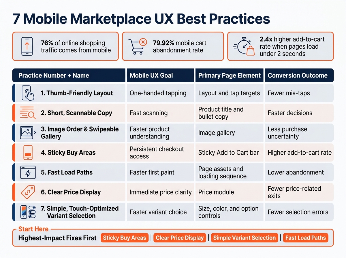
7 Mobile Marketplace UX Best Practices: Goals, Elements & Outcomes
Use this table to compare the seven mobile UX practices at a glance. It shows how each one shapes the mobile purchase path.
| Practice | Mobile UX Goal | Primary Page Element | Conversion Outcome |
|---|---|---|---|
| 1. Thumb-Friendly Layout | One-handed tapping | Layout and tap targets | Fewer mis-taps |
| 2. Short, Scannable Copy | Fast scanning | Product title and bullet copy | Faster decisions |
| 3. Image Order and Swipeable Gallery | Faster product understanding | Image gallery | Less purchase uncertainty |
| 4. Sticky Buy Areas | Persistent checkout access | Sticky Add to Cart bar | Higher add-to-cart rate |
| 5. Fast Load Paths | Faster first paint | Page assets and loading sequence | Lower abandonment |
| 6. Clear Price Display | Immediate price clarity | Price module | Fewer price-related exits |
| 7. Simple, Touch-Optimized Variant Selection | Faster variant choice | Size, color, and option controls | Fewer selection errors |
If you can’t work on all seven at once, start with sticky buy areas, clear price display, simple variant selection, and fast load paths. Those fixes tend to remove friction early. Then roll out the rest using that same order in the rollout plan below.
How Marketplace Teams Can Put These Practices to Work
If you can’t change the whole page, start with what you do control. On marketplaces, that usually means only part of the listing. So put your time into the areas that tend to move mobile conversion most: titles, bullets, images, pricing, and variants.
A good first step is a mobile-only audit of your top revenue SKUs. Open each listing on a smartphone and check a few basics:
- Title: brand, product type, and key benefit should appear within the first 80–100 characters
- Bullets: the first three should be readable within two thumb scrolls
- Main image: should fill the frame and still make sense at thumbnail size
Focus first on SKUs with high traffic but low mobile conversion. Those often give you the best return for the time you spend. Once the basics are in place, you can fine-tune platform details like image order and variant setup.
Then adjust the listing to fit each marketplace’s rules and shopping behavior. On Amazon, put the brand and main benefit early in the title. Make the first three bullets benefit-led and easy to read on their own. In the image gallery, Images 2 and 3 should show the product in use or in a lifestyle setting. On Walmart, use images that line up with the product name and key attributes. Listings need at least two images, so image order matters right away. Titles should stay clean and direct. Target leans toward plain, benefit-led language, so bullets should start with family or use-case benefits before getting into specs. On TikTok Shop, the product description should echo the hook from your video, because shoppers arrive with that message already in mind.
After the copy and images, look at the structure behind the listing. Fix variant architecture. Poor parent/child grouping can split reviews and slow down decision-making on a small screen. Where platform rules allow it, simplify variant grouping. Bad structure makes selection harder and scatters review proof.
Emplicit helps brands improve marketplace listings, content, PPC, inventory, and account health across Amazon, TikTok Shop, Walmart, and Target.
Conclusion
Mobile marketplace UX needs its own optimization. Mobile drives a big share of ecommerce revenue, yet mobile cart abandonment still lags behind desktop by 10–15 points. That gap usually doesn’t come from one glaring issue. It comes from a mobile conversion path that feels a little too slow, a little too crowded, or a little too hard to finish.
These seven practices help cut friction across that path while staying within marketplace limits. After that, the next step is simple: validate each update with mobile-only testing.
On high-volume mobile traffic, small wins add up fast.
Track mobile add-to-cart, checkout initiation, and conversion as separate metrics. Test one change at a time so you can see what moved the needle.
If you need help turning those findings into listing changes, Emplicit helps brands improve listings, content, PPC, and marketplace management across Amazon, TikTok Shop, Walmart, and Target.
FAQs
Which mobile UX fixes should I prioritize first?
Prioritize fixes that make shopping easier and have the biggest impact on conversion. Start with product images, clear pricing, and CTA placement.
Make the primary CTA visible without scrolling. Add a sticky buy bar. Use high-resolution, zoomable images. Keep the layout mobile-first with a single-column design.
For text, use font sizes of at least 16px, and place key details within the first 80 characters.
How can I test mobile marketplace UX changes effectively?
Use a disciplined, data-driven approach. Start with a friction audit. Look at click maps, scroll depth, and session recordings to spot where people drop off.
Then prioritize your tests with the PIE framework:
- Potential: How much room is there for improvement?
- Importance: How much traffic or revenue does this page affect?
- Ease: How simple is the test to run?
Test one element at a time so you know what changed the result. Run mobile-specific tests for at least 14 days, and wait until each variant reaches 100 conversions before making a call.
One more thing: test on real mobile devices, not just resized desktop browsers. A page can look fine on your laptop and still feel clunky on an actual phone.
What can brands control on marketplace mobile pages?
Brands can shape a big part of how product listings look on mobile, and that can help improve conversion. The main areas to work on are product titles, bullet points, images, technical details, and A+ content modules.
In titles, put the most important keywords and product features near the beginning. For bullet points, lead with clear, benefit-focused copy and use capitalized headers to make key info easier to scan. For images, use high-resolution visuals that still look sharp on smaller screens.
Technical details should be organized in collapsible accordions so shoppers can find specs without wading through a wall of text. And for A+ content, stick with clean, single-column layouts and avoid putting text inside images, since that text can be hard to read on mobile.