

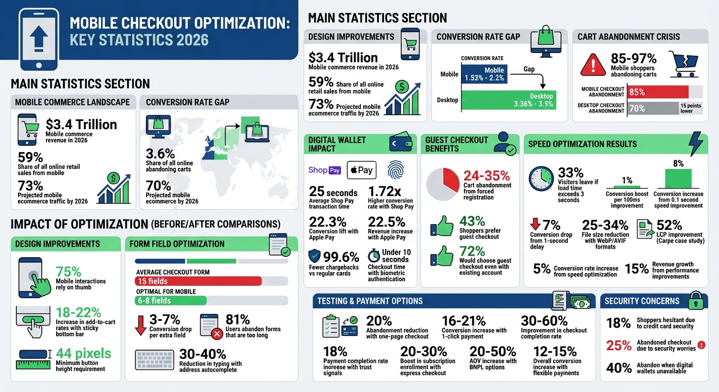
In 2026, mobile commerce dominates online shopping, generating $3.4 trillion in revenue and accounting for 59% of all online retail sales. Yet, mobile conversion rates still lag behind desktop, with mobile rates between 1.53% and 2.2% compared to desktop’s 3.36% to 3.9%. The main culprit? Frustrating checkout experiences. Issues like small buttons, forced account creation, surprise costs, and slow page loads cause 85%-97% of mobile shoppers to abandon their carts. Fixing these problems can unlock billions in lost revenue.
Key Takeaways:
- Simplify Checkout: Reduce form fields to 6-8, enable guest checkout, and use tools like address autocomplete.
- Optimize for Mobile: Design for one-handed use, prioritize the "thumb zone", and ensure buttons are at least 44 pixels tall.
- Speed Matters: Cut page load times (even 0.1 seconds faster can boost conversions by 8%).
- Offer Flexible Payments: Add digital wallets like Apple Pay and Google Pay, and consider Buy Now, Pay Later options.
- Build Trust: Include security indicators like SSL certificates and biometric payment options.
By improving usability, offering faster payment options, and addressing technical issues, businesses can significantly improve mobile conversion rates and reduce cart abandonment.
Mobile Checkout Optimization Statistics and Impact 2026
Designing Mobile Checkout for Easy Use
One-Handed Navigation Design
Did you know that 75% of mobile interactions rely on the thumb? That’s why it’s crucial to design key actions in the bottom 40% of the screen, also known as the "thumb zone." This area is where users naturally tap, making it the prime spot for buttons like "Place Order" or "Continue to Payment" [9, 11]. Adding a sticky bottom bar that keeps the checkout button visible can even increase add-to-cart rates by 18% to 22%.
When it comes to touch targets, size and spacing matter. Buttons and input fields should be at least 44 pixels tall, with at least 8 pixels of space between them to avoid accidental taps. These small adjustments make a big difference in usability [4, 10, 9].
Once navigation is optimized, the next step is simplifying the checkout process by cutting down unnecessary form fields.
Reducing Form Fields
On average, checkout forms have about 15 fields, but for mobile checkouts, only 6 to 8 fields are usually necessary [4, 14]. Why? Because every extra field can lower conversion rates by 3% to 7%, and a staggering 81% of mobile users abandon forms they find too long.
To decide which fields to keep, ask yourself:
- Is this information legally required?
- Is it essential to complete the purchase?
- Could it be collected later?
If the answer is "no" to all three, remove the field. For example, you can combine "First Name" and "Last Name" into a single "Full Name" field [6, 10]. Fields like "Address Line 2" and "Company Name" can be optional and hidden behind a link. Defaulting the billing address to "Same as Shipping" also saves users time [10, 14].
Another way to speed things up? Use tools like the Google Places API for address autocomplete, which can reduce typing effort by 30% to 40% [11, 14]. And don’t forget to trigger the right keyboard for each field – like a numeric keypad for phone numbers or an email-specific keyboard for email addresses [9, 12].
After trimming the form, make sure users can easily see their progress.
Progress Tracking and Order Summaries
Long forms can overwhelm mobile users, but clear progress tracking can ease that anxiety. Breaking the checkout into labeled steps – like "Step 2 of 3" or "Shipping → Payment → Review" – lets users know exactly where they are [4, 12].
To keep things manageable, use progressive disclosure. For instance, collapse the order summary into a "tap to expand" section at the top of the screen. This keeps the focus on the payment form without forcing users to scroll through product details [4, 10, 13]. Even if the total number of fields stays the same, splitting the process into shorter steps can make it feel faster [12, 14].
Finally, display a condensed cart total that’s always visible during checkout. Users can tap to see detailed itemized information, striking a balance between simplicity and transparency. By combining these elements, you create a checkout experience that’s smooth, intuitive, and user-friendly.
sbb-itb-e2944f4
Adding Payment Options That Work
Digital Wallet Support
Digital wallets like Apple Pay, Google Pay, and Shop Pay make checkout faster and easier by using pre-stored shipping and billing information. For example, Shop Pay processes transactions in just 25 seconds on average and delivers a 1.72x higher conversion rate compared to standard checkouts. For returning users, the conversion rate jumps to 1.91x.
Features like Face ID, Touch ID, and fingerprint scans reduce checkout times to under 10 seconds while boosting security. Plus, digital wallets simplify the process by cutting the number of clicks from as many as 120 to just 4. This convenience leads to measurable results – businesses offering Apple Pay see a 22.3% lift in conversion rates and a 22.5% increase in revenue.
To make the most of these tools, place express payment buttons above the fold on product pages and at the top of the checkout page. Arrange them with Shop Pay first, followed by Apple Pay and Google Pay. Digital wallets also reduce the risk of fraud, generating 99.6% fewer chargebacks than regular card transactions, which simplifies compliance and security concerns.
These tools ensure a seamless checkout experience, even for shoppers who aren’t registered users.
Allowing Guest Checkout
Requiring shoppers to create an account can severely hurt your sales. Studies show that 24% to 35% of customers abandon their carts when forced to register. The issue is even worse on mobile devices, where on-screen keyboards take up 40–50% of the display, making long forms more frustrating.
To counter this, make the "Checkout as Guest" option easy to find on your mobile checkout page. Gather only the most essential details during the process, and then invite users to register on the "Thank You" page. If you want to encourage account creation, offer social login options like "Sign in with Apple" or "Google" to streamline the process. Keep in mind that 43% of shoppers prefer guest checkout, and 72% would still choose it even if they already have an account.
Subscription Payment Setup
If your business relies on subscriptions, the checkout process plays a big role in enrollment success. Offering express checkout for recurring billing can boost enrollment rates by 20–30%. Using native platform APIs, such as Shopify’s, allows subscription products to be purchased with the same one-click simplicity as single purchases.
For higher-priced items (over $50), consider offering Buy Now, Pay Later (BNPL) options like Klarna, Afterpay, or Affirm. These options make products feel more affordable and can increase average order values by 20–50%. Display installment amounts (e.g., "4 payments of $25") directly on product pages to help shoppers feel more comfortable with their purchase early in the buying process.
Adding flexible payment methods can increase overall conversion rates by 12–15%. With mobile checkout abandonment rates at 85%, which is 15 points higher than desktop, providing a variety of payment options can make a huge difference in turning browsers into buyers.
Technical Improvements for Faster Checkout
Speeding up mobile checkout goes beyond design tweaks and payment options. Technical upgrades play a critical role in reducing cart abandonment and improving conversion rates.
Reducing Page Load Times
Page speed isn’t just a "nice-to-have" – it’s directly tied to revenue. About 33% of mobile visitors leave sites that take over 3 seconds to load. Even shaving 100 milliseconds off load time can boost retail conversions by about 1%. With mobile projected to account for 73% of ecommerce traffic by 2026, optimizing performance is a must.
Start with images. Converting product visuals to WebP or AVIF formats can reduce file sizes by 25–34% compared to JPEGs. Aim to keep product images under 100–150KB and hero banners under 200KB. Use loading="lazy" for images below the fold, but avoid this for above-the-fold content like hero banners to maintain a strong Largest Contentful Paint (LCP) score.
Next, review your third-party scripts. Use Chrome DevTools to sort JavaScript files by size and remove any unused scripts from the past 90 days. As one expert puts it:
"Every script you delete is a script you never have to optimize." – EcomHint
Defer non-essential scripts, like chat widgets or analytics tools, until after the main content loads. A Content Delivery Network (CDN) can also significantly cut load times by serving static assets from servers closer to your users, often reducing load times by over 50%.
Focus on improving Core Web Vitals: target an LCP under 2.5 seconds, an Interaction to Next Paint (INP) under 200 milliseconds, and a Cumulative Layout Shift (CLS) under 0.1. For example, Trendyol, an ecommerce platform, halved its mobile INP from 963ms to 481ms in 2024, boosting click-through rates by 1% from product listings to detail pages. Similarly, Shopify store Carpe improved its LCP by 52%, leading to a 5% conversion rate increase and 15% revenue growth.
Once load times are optimized, the next step is to simplify data entry for users.
Autofill and Address Completion
Typing on mobile is prone to errors. Using incorrect keyboard types can increase error rates by 30–40% and add 3–5 seconds to form completion time. The solution? Implement proper HTML type attributes. For example, use type="email" for email fields, type="tel" for phone numbers, and inputmode="numeric" for credit card and CVV fields.
Take advantage of the HTML autocomplete attribute for fields like given-name, postal-code, and cc-number. This allows browsers and password managers to pre-fill data, cutting form completion time by 40–60% on mobile.
Address autocomplete is another game-changer. Using postal code lookup APIs (available for under $11/month) can auto-fill city and state fields, reducing manual input and speeding up checkout by 30–50%. This approach can recover 20–30% of lost mobile conversions.
Incorporate real-time inline validation to catch errors as users leave each field, instead of waiting for form submission. This prevents the frustration of scrolling back to find mistakes on a small screen. Additionally, program the form to auto-advance the cursor to the next logical field once the current one is completed.
While speed and simplicity are crucial, building trust through security features is just as important.
Security Features That Build Confidence
Security concerns are a major reason for cart abandonment. Around 18% of shoppers hesitate to enter their credit card information due to trust issues, and 25% have abandoned a checkout process in the last three months over security worries. These concerns are amplified on mobile, where the URL bar is often hidden, and the interface feels more constrained.
Start by ensuring your site uses an SSL/TLS certificate for HTTPS. Browsers flag non-secure HTTP sites, which can immediately drive users away. To further reassure shoppers, display security indicators like lock icons or phrases such as "256-bit SSL encryption" or "Secured by Stripe" next to payment fields, not just in the footer. Inline trust signals can improve payment completion rates by 18%.
"A clear, honest ‘Secured by Stripe’ statement is more credible than a generic padlock graphic you created in Photoshop." – Digital Applied
Enable biometric authentication through Apple Pay and Google Pay. These digital wallets let users authenticate using Face ID or Touch ID while also enhancing security. This is critical, as 40% of mobile shoppers abandon carts when digital wallet options aren’t available.
Use machine learning fraud detection systems to identify suspicious activity without disrupting legitimate transactions. Real-time Luhn validation can also catch credit card typos before submission. Finally, display a PCI DSS compliance statement near the card entry form and include a tooltip explaining the CVV code to ease concerns during payment.
Testing and Improving Checkout Performance
Fine-tuning a checkout process doesn’t stop at design or technical updates – it demands systematic testing to ensure every tweak translates into measurable revenue growth. By analyzing performance and continuously testing, you can uncover opportunities to enhance conversions even further.
A/B Testing Checkout Elements
Testing is essential to refining your checkout process. A great way to prioritize what to test is by using the PIE Framework – evaluating ideas based on their Potential (room for improvement), Importance (how much traffic interacts with the element), and Ease (how simple it is to implement). This ensures you focus on impactful changes rather than wasting time on minor adjustments.
Each test should begin with a clear hypothesis that connects the data to an expected outcome. For example, if analytics show users abandoning during payment, you might hypothesize that repositioning digital wallet options could improve conversions.
It’s also important to separate mobile and desktop tests. Mobile users face unique challenges, such as thumb reach issues or slower connections. Run mobile-specific tests for at least 14 days, ensuring each variation achieves 100 conversions before drawing conclusions.
Focus on high-impact areas first, like:
- Placement of express checkout buttons
- Enabling guest checkout by default
- Reducing the number of form fields
For example, switching to a one-page checkout can reduce abandonment by 20%. Adding 1-click payment options, such as Apple Pay, can increase conversions by 16% to 21%. But don’t stop at conversion rates – track Revenue Per Visitor (RPV) to ensure changes don’t unintentionally lower your average order value.
By tracking results with clear metrics, you can translate test insights into actionable improvements.
Monitoring Performance Metrics
Keeping a close eye on performance metrics helps you identify gaps and opportunities. Start by examining the difference between mobile and desktop conversion rates. If mobile lags significantly behind, it’s a sign that friction is slowing things down.
One key metric to monitor is your checkout completion rate – the percentage of users who start and finish the process. Optimized mobile checkouts can show a 30–60% improvement here. Also, be mindful of form field friction; every field added beyond the eighth can cause completion rates to drop by 4–6%.
Another critical factor is Core Web Vitals. Even a one-second delay can lead to a noticeable drop in conversions. Additionally, track how payment methods perform. Digital wallets now account for 49–56% of global eCommerce transaction value, and adding Apple Pay can boost conversions by 22.3% and revenue by 22.5%.
These metrics not only guide ongoing improvements but also inform strategic decisions moving forward.
Working with Emplicit for Better Results

Optimizing the checkout process requires both technical know-how and consistent testing – areas where specialized partners like Emplicit can make a real difference. Their comprehensive eCommerce services cover everything from marketplace management to PPC optimization, ensuring that your traffic converts efficiently.
Emplicit handles critical technical integrations, such as setting proper HTML input types and API connections, which can cut form completion times by 40–60%. They also leverage device-specific analytics and session recordings to uncover friction points that standard tools might overlook. By aligning paid acquisition strategies with checkout improvements, they ensure every advertising dollar delivers maximum ROI.
They also know the value of trust signals. Strategically placing these during payment can increase completion rates by 18%. With U.S.-based account managers and tailored strategies for platforms like Amazon, TikTok Shops, Walmart, and Target, Emplicit treats checkout optimization as a key driver of revenue growth. As DigitalApplied explains:
"Checkout UX is your highest-ROI fix: Complex checkout flows are the second most common abandonment reason after unexpected costs. Every friction point you eliminate at checkout compounds directly into revenue".
Conclusion
Main Points to Remember
Optimizing mobile checkouts is all about reducing friction to recover revenue lost to cart abandonment. The key practices are straightforward: design interfaces for one-handed use by positioning essential buttons in the thumb zone (the bottom third of the screen), streamline guest checkout by limiting form fields to 12–14, and enable digital wallets to simplify data entry.
Speed is just as critical as simplicity. Even a one-second delay in load time can slash conversions by 7%, while adopting 1-click checkout can boost conversions by 16–21%. Adding trust signals near payment fields can further increase completion rates by 18%.
These principles, rooted in interface design, payment options, and technical enhancements, provide a clear roadmap for immediate improvements.
Getting Started with Optimization
To put these strategies into action, start with a friction audit. Compare mobile and desktop analytics to identify problem areas like slow load times or forced account creation. Then, focus on high-impact fixes: enable guest checkout by default, integrate address autocomplete using the Google Places API, and ensure mobile-friendly input types trigger the correct keyboards.
Validate updates through mobile-specific A/B testing and track performance metrics to confirm profitability gains. As Stormy AI emphasizes:
"If you aren’t testing, you’re leaving your revenue to chance. In 2026, the data always beats the ‘expert’ opinion".
For businesses juggling multiple sales channels – whether on Amazon, TikTok Shops, Walmart, Target, or their own eCommerce platforms – checkout optimization demands both technical expertise and continuous refinement. Emplicit offers comprehensive eCommerce solutions, from marketplace management to technical integrations and strategic testing, ensuring these optimizations drive measurable growth. With U.S.-based account managers and tailored strategies for each platform, Emplicit helps turn checkout improvements into tangible results.
FAQs
What are the fastest mobile checkout fixes that improve conversions?
If you’re looking to increase mobile checkout conversions, the key is to make the process as smooth and straightforward as possible. Here are some effective strategies:
- Enable one-click or express payments: Simplify the payment process by offering options like Apple Pay, Google Pay, or other express checkout methods. Fewer steps mean fewer chances for customers to abandon their carts.
- Minimize form fields: Only ask for the essentials. Long, tedious forms can frustrate users, especially on smaller screens.
- Optimize layouts for mobile: Make sure your checkout page is designed with mobile users in mind. Buttons should be easy to tap, text should be legible, and the layout should feel intuitive.
- Use autofill features: Save users time by enabling autofill for fields like shipping and payment information. This reduces effort and speeds up the entire process.
- Add trust signals: Include security badges, SSL indicators, and other trust-building elements. These reassure customers that their information is safe, making them more likely to complete their purchase.
By addressing these areas, you can significantly lower cart abandonment rates and create a smoother shopping experience for your mobile customers.
Which payment options should I add first for mobile shoppers?
To make mobile checkouts smoother, focus on integrating payment options like Apple Pay, Google Pay, and buy-now-pay-later services such as Shop Pay. These tools simplify the process with perks like auto-filled details and one-tap payments, making it easier for customers to complete their purchases. Additionally, tackling common issues – like slow-loading pages and overly complicated forms – can significantly cut down on cart abandonment and improve the overall shopping experience on mobile devices.
How can I measure if mobile checkout changes are effective?
Tracking important metrics such as the cart abandonment rate and conversion rate is crucial for assessing the effectiveness of your updates. Using tools like A/B testing or analytics platforms allows you to compare performance data before and after making changes. For instance, simplifying forms or introducing express payment options can lead to better outcomes. By consistently monitoring these metrics, you can fine-tune your mobile checkout process to make it smoother and motivate shoppers to finalize their purchases.