
Your product page is where sales happen. A poorly structured page drives shoppers away, while a well-organized one boosts conversions. Here’s what works:
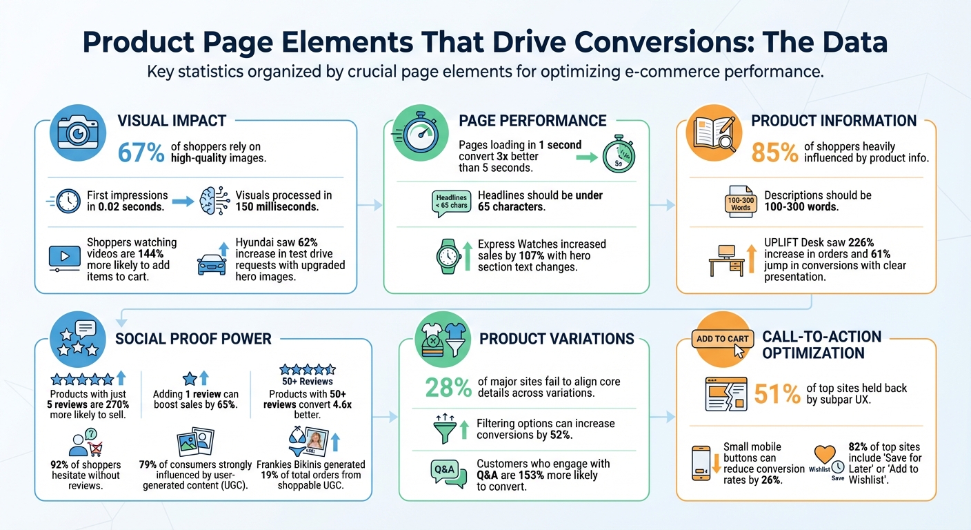
- Visuals Matter: 67% of shoppers rely on high-quality images to make decisions. Use multiple angles, zoom features, lifestyle shots, and videos to showcase your product.
- Fast Loading Speeds: Pages loading in 1 second convert 3x better than those taking 5 seconds.
- Clear Headlines: Communicate the product’s value in under 65 characters. Avoid vague language.
- Concise Descriptions: Focus on benefits first, then features. Use bullet points for easy scanning.
- Social Proof: Reviews, Q&A, and user-generated content build trust. Products with just 5 reviews are 270% more likely to sell.
- Call-to-Action (CTA): Place a bold, visible "Add to Cart" button above the fold. Use clear, direct language.
Product Page Conversion Statistics: Key Data Points for E-commerce Success
Ultimate Guide to Product Page Conversion Rate Optimization (CRO) 🔥
sbb-itb-e2944f4
The Hero Section: Making a Strong First Impression
The top part of your product page – the area visible before scrolling – plays a crucial role in capturing user attention. Studies reveal that users form their first impression in just 0.02 seconds, and visuals are processed by the brain in as little as 150 milliseconds. This means your hero section needs to deliver instant clarity and impact.
Using High-Quality Product Images
High-resolution visuals are non-negotiable, as 67% of consumers say they rely on quality images when making purchase decisions. Avoid blurry or poorly lit photos. Your main image should feature the product against a clean, neutral background – think white or gray – to keep the focus on the product and minimize distractions. Including multiple angles and a zoom feature lets customers examine textures, stitching, and other details as if they were inspecting the product in person.
Lifestyle photography, on the other hand, helps customers picture the product in their daily lives. While clean product shots showcase technical details, lifestyle images add context and relatability. For example, when Hyundai upgraded their hero section with larger, high-quality images, test drive requests jumped by 62%.
"My experience as a web designer has taught me that when it comes to ecommerce, people do judge a book by its cover, so invest in solid product photography."
- Mark Perini, Founder, ICEE Social
Videos can take this a step further. Shoppers who watch product videos are 144% more likely to add items to their cart. Videos demonstrate how a product moves, fits, or functions, making them especially useful for items like clothing, furniture, or anything with moving parts.
Once your visuals grab attention, your headlines need to deliver a clear and compelling message about the product.
Writing Clear Headlines and Taglines
Your headline should instantly communicate what the product is and why it’s valuable. Skip vague language and focus on a specific benefit. For example, instead of saying "Premium Quality Kitchen Essentials", try "Non-Stick Cookware That Actually Stays Non-Stick." Keeping headlines under 65 characters ensures clarity and improves search engine performance.
Express Watches in the UK saw the power of a strong headline firsthand. When they changed their hero section text from "Never Beaten on Price" to "Seiko Authorized Dealer Site", their sales increased by 107%. A good headline answers the customer’s question, “What’s in it for me?” The faster you communicate value, the more likely users are to stay engaged.
Writing Product Descriptions That Convert
Your product description needs to answer one key question: "How will this make my life better?" A clear, well-written description not only supports the design of your page but also helps potential buyers make quick, confident decisions. In fact, 85% of shoppers say that product information heavily influences their choice between brands. So, getting this right can directly impact your sales.
The most effective descriptions strike a balance between benefits (how the product improves the customer’s life) and features (the technical details of the product). For instance, a feature might be "100% organic lotion", but the benefit is "Feel confident with soft, smooth hands". By focusing on benefits first, you help customers picture themselves using the product, while the features provide the reassurance they need to hit "Buy Now." This balance also makes it easier to design a concise, easy-to-read format.
"The paramount goal for your product pages should be to build user confidence by providing all the information necessary for a purchasing decision and making the process as intuitive and straightforward as possible."
- Rosara Joseph, Content Strategist, VentureWeb
Since most shoppers skim rather than read every word, it’s essential to organize information so they can find key details quickly. Stick to descriptions between 100 and 300 words, and avoid overloading your text with flowery marketing language. Buyers want straightforward answers about what the product looks like and how it works – not a sales pitch.
Listing Key Features and Benefits
Bullet points are your best friend here. Highlight the top 3-5 benefits right away so they’re impossible to miss. This format works because it mirrors how people read online – they’re more likely to focus on the beginning of lines and paragraphs than the end.
For example, when UPLIFT Desk replatformed to BigCommerce in 2016, they introduced an interactive "desk builder" with high-resolution swatches and assembly videos. This change, paired with scannable bullet points listing features and benefits, led to a 226% increase in orders, a 61% jump in conversion rates, and a 203% growth in customers. While the configurator played a big role, the clear presentation of information helped buyers make decisions faster.
Start with what makes your product stand out. Avoid wasting the first few lines on generic statements. For instance, instead of saying, "Our premium cookware is designed with the modern chef in mind", go straight to the point: "Heats evenly across the entire surface – no more burnt edges or cold spots."
| Element | Best Practice | Purpose |
|---|---|---|
| Key Benefits | List top 3-5 benefits first in bullet points | Allows quick scanning for easier decisions |
| Usage/Care | Use short bullet points or embed a video | Demonstrates product longevity and maintenance tips |
| Materials/Origin | Include a brief paragraph or icons | Justifies price by highlighting quality or eco-friendly aspects |
Think about the questions customers are likely to have and answer them directly in your description. For clothing, address fit and care instructions. For electronics, explain compatibility and setup. Providing answers upfront keeps customers on your page instead of searching elsewhere. Once you’ve covered the benefits, separate the technical details to maintain clarity.
Presenting Technical Specifications
Technical information is important, but it shouldn’t overwhelm the main product description. Use tabs, accordions, or expandable sections to keep the page clean while still catering to shoppers who want detailed specs. If you include technical terms, add brief explanations to make them accessible.
For example, SportsShoes.com manages a catalog of over 15,000 products by organizing descriptions, specs, and policies into accordion menus. This approach keeps the main view tidy while giving interested buyers easy access to additional details.
Similarly, Tradelink uses a tabbed interface that separates product descriptions, specifications, and downloadable spec sheets. This eliminates the need for endless scrolling and helps customers quickly find the information they need.
For complex products like furniture, electronics, or appliances, comparison tables can be a game-changer. These tables allow customers to view attributes like capacity, materials, or size side-by-side, making it easier to choose between models or configurations. Ensure consistency across similar products in your catalog so shoppers can compare options without confusion.
Haven, a company that sells duffel bags, uses nested headers to organize dense details like product features, sizing, and warranty information. This keeps their product pages clean while ensuring customers can still find all the specifics they need to feel confident about their purchase.
"Descriptions don’t have to be bland. Invest the time and energy to speak to your users. You have about .02 seconds to make an impression on them, so make it a lasting one by owning your voice!"
- Maria Bonello, Director of Strategy, SMAKK Studios
For example, if you mention "recycled polyester", include a quick note about its durability or its impact on the environment. This builds trust and ensures customers feel informed.
Presenting Product Variations Clearly
When a product comes in multiple sizes, colors, or models, how you present those options can directly impact sales. Surprisingly, 28% of major ecommerce sites fail to align core product details across variations. This means customers might miss out on reviews, specifications, or images when switching between options. To avoid this, group all variations under one listing. Whether it’s a shirt in five colors or a desk in three finishes, consolidating everything on a single page simplifies the shopping experience. This approach ensures consistency across visuals, reviews, and technical details.
Take UPLIFT Desk as an example. When they switched to BigCommerce in 2016, they introduced an interactive "desk builder." This tool allowed customers to view 3D-rendered variations of wood grains and accessories in real time, making selection easier and more engaging.
Creating an Easy-to-Use Selection Interface
Visual tools like swatches or thumbnails for colors and patterns can speed up decision-making. Instead of reading through text, customers can visually scan options, which is much faster. When a customer clicks a swatch, the main product image should update immediately to reflect their choice. This kind of instant feedback removes any guesswork.
For products with more complex combinations – like a chair with different frame and seat colors – use thumbnails that show the exact pairing. For instance, instead of imagining what "Black Frame + Gray Seat" looks like, the customer can see it immediately. Providing 2–4 unique images for each variation helps reinforce clarity and builds customer confidence. To save on production costs, consider reusing lifestyle or "in-use" photos across all variants.
Presenting information in a clear and intuitive way reduces friction throughout the shopping process. Avoid horizontal tabs for product details – 27% of users overlook them entirely, while only 8% miss content in vertical layouts like accordion menus. Opt for vertical designs to ensure customers don’t miss key details like specifications or reviews.
Managing Out-of-Stock Options
Once you’ve nailed the selection interface, it’s crucial to address availability issues upfront. Few things are more frustrating than selecting a size or color only to find it unavailable at checkout. Availability for each variation should be clearly communicated on the product page itself – not after a customer tries to add it to their cart. Use visual cues like grayed-out options or strikethroughs to indicate which variations are unavailable.
"Users should know when items aren’t available, without having to add an item to the cart only to find out it is backordered or sold out."
- Katie Sherwin, Senior UX Specialist, Nielsen Norman Group
For out-of-stock items, offer a "Notify Me" option so customers can receive email alerts when their preferred size or color is back in stock. For example, Johnny Cupcakes uses a personalized wishlist feature that lets customers specify the exact attributes of unavailable t-shirts. Once restocked, the system automatically sends an email notification. This strategy not only keeps potential buyers engaged but also captures leads – important since around 70% of visitors who abandon an ecommerce site never return.
| Feature | Best Practice for Variations | UX Benefit |
|---|---|---|
| Selection Interface | Use color swatches or thumbnails | Speeds up visual recognition |
| Image Gallery | Link images to specific variants | Confirms the user’s selection visually |
| Out-of-Stock | Use indicators like strikethroughs | Reduces frustration during the purchase |
| Specifications | Maintain consistent units | Simplifies comparison between variations |
Lastly, ensure that key content – like reviews, descriptions, and specifications – remains consistent across all variations. For example, switching from "Medium" to "Large" should not mean losing access to reviews or product details. This consistency reassures customers and provides all the information they need to make a confident purchase decision.
Using Social Proof to Increase Trust
Most shoppers hesitate to buy products without reviews, and the numbers back this up: adding just one review can boost sales by 65%. Products with at least five reviews are 270% more likely to be purchased, and items with 50 or more reviews can convert 4.6 times better than those without. Simply put, reviews show potential buyers that others trust and enjoy your product, making them more confident in their decision to purchase.
Showing Customer Reviews
To ease customer doubts, display reviews prominently near crucial details like the product title and price. Start with a "Review Snippet" – a star rating and review count – above the fold, and follow it up with a detailed "Review Snapshot" further down the page. This snapshot can break down ratings by star level and highlight recurring themes from customer feedback.
Authenticity is key. Shoppers value a mix of positive and negative reviews. As Olivia McNaughten, Product Marketing Manager at Yotpo, notes:
"If the feedback is entirely positive, 95% believe the reviews are fake or screened by the company."
In fact, 82% of shoppers actively look for negative reviews to make informed decisions. Interestingly, customers who use 1-star review filters convert at a rate of 7.8%, compared to just 3.7% for those who don’t engage with reviews. Offering filtering options, such as by skin type or height, can increase conversions by 52%. Additionally, placing Q&A content above detailed reviews can make a big difference – customers who engage with user-generated Q&A are 153% more likely to convert. Adding "Verified Buyer" badges to reviews also enhances credibility by confirming that the reviewer actually purchased the product.
When negative reviews surface, respond quickly and professionally. This approach can turn potential detractors into trust-building opportunities. Never delete negative feedback – transparency fosters long-term customer loyalty.
Adding User-Generated Content from Social Media
Customer reviews build trust, but user-generated content (UGC) takes it a step further. Photos and videos shared by buyers on platforms like Instagram and TikTok offer a raw, relatable perspective that shoppers often trust more than polished product images. Despite this, 67% of e-commerce product pages still lack social media visuals from past customers. This is a missed opportunity, as 79% of consumers say UGC strongly influences their purchasing decisions.
Integrate social media content into your product pages by embedding customer photos or videos in the product gallery or near the "Add to Cart" button. Use small icons, like Instagram or TikTok logos, on thumbnails to show where the content originated and link back to the original posts. This transparency enhances trust. Make these visuals shoppable, allowing users to click on thumbnails to see larger versions with direct links to the featured products.
For example, Frankies Bikinis used shoppable UGC through the Foursixty platform, resulting in 19% of total orders and over 23% of online revenue coming from these social galleries. Similarly, MICHI incorporated shoppable Instagram content into its store and saw a 51x ROI within just 30 days.
Always get explicit permission from customers before using their social media posts, and credit the original creators by tagging or mentioning them. For incentivized posts, clearly label them as "Incentivized" and include a tooltip explaining what that means to remain transparent and comply with FTC guidelines. Additionally, use UGC to showcase your product in various settings or on individuals of different sizes to help shoppers imagine how it fits into their own lives.
Creating Clear Call-to-Action Buttons
Once you’ve optimized your visuals and descriptions, a clear and compelling call-to-action (CTA) becomes the final nudge that guides customers toward making a purchase.
The CTA button is the centerpiece of your product page. It’s what transforms casual browsers into paying customers. Surprisingly, 51% of top e-commerce sites are held back by subpar product page UX, often due to poorly designed or hard-to-spot CTAs. A well-placed, attention-grabbing button can mean the difference between a completed sale and an abandoned cart.
Positioning Add-to-Cart Buttons
Your primary CTA needs to be front and center – visible without any scrolling. Maria Bonello, Strategy Director at SMAKK Studios, stresses its importance:
"This is the most important component on the page, and should stand out from the surrounding content. The area around the button should be uncluttered so that there are no distractions or obstacles that block the user."
Place the "Add to Cart" button directly beneath key details like price, shipping information, and stock status. This placement helps streamline the decision process. Surround the button with ample white space to naturally draw attention to it.
For mobile users, position the button in the lower half of the screen and ensure it’s at least 44×44 pixels in size to prevent accidental taps. Small buttons can reduce mobile conversion rates by up to 26%. A sticky CTA – one that stays visible as users scroll – can be particularly effective for lengthy product pages. As Bonello points out:
"If your product description pushes the Add to Cart button below the bottom of the browser, it’s time for a redesign."
Use bold, high-contrast colors like orange, green, or blue to make the button pop against the page background. Avoid using vague or overly clever wording. As Courtney Hartmann Tisa of Internet Marketing Inc. advises:
"Don’t try to be clever with CTAs. Direct Add to Cart or Submit Order will do."
Simple, action-focused language ensures customers know exactly what to expect when they click.
Including Additional Action Options
Adding secondary options like "Save for Later" or "Add to Wishlist" can help capture indecisive shoppers and encourage them to return later. This taps into the Zeigarnik effect, which is the tendency to revisit unfinished tasks. Notably, 82% of top-performing e-commerce sites now include these features.
Make these secondary actions easy to use by allowing guest users to save items without requiring account registration. Forced sign-ups often lead to cart abandonment. To ensure these options don’t overshadow your main CTA, design them to be smaller and less visually prominent.
If a product variation is out of stock, clearly indicate this by graying it out and offering an email notification option. This not only keeps customers informed but also provides an opportunity to re-engage them when the item is restocked. Adding urgency cues – like "Only 3 left in stock" – near your CTA can also create a sense of FOMO, prompting quicker purchases.
For additional flexibility, consider integrating Buy Now, Pay Later (BNPL) services like Klarna or Affirm near your CTA. These options can help remove price barriers. Similarly, a "Subscribe and Save" option can encourage recurring purchases while giving customers more control over their buying habits.
Conclusion
This guide has highlighted how using structured visuals, clear details, and genuine social proof can significantly boost conversions. The foundation of a high-converting product page lies in a few key elements: high-quality visuals that showcase the product effectively, detailed product information that addresses customer concerns, and authentic reviews that build trust. As Rosara Joseph, Content Strategist at VentureWeb, explains:
"The paramount goal for your product pages should be to build user confidence by providing all the information necessary for a purchasing decision and making the process as intuitive and straightforward as possible."
The data backs this up: 85% of shoppers say product information and images heavily influence their brand choices, and 92% are hesitant to purchase without reviews. These aren’t just nice-to-haves – they’re essential. Even small tweaks can make a big impact. For instance, in 2025, Express Watches saw sales jump by 107% by simply changing their product image message from "Never Beaten on Price" to "Seiko Authorized Dealer Site".
Adapting product pages to evolving customer needs is critical. Continuous testing is what separates average pages from exceptional ones. A great example is Hush Blankets, which in 2025 identified a 70% drop-off rate on their product page funnel. By repositioning thumbnail images, they increased checkout rates by 33.1%. These results show how data-driven adjustments can lead to measurable improvements.
To get started, focus on the basics: engaging visuals, clear and concise information, strong call-to-action buttons, and trustworthy reviews. Then, commit to ongoing optimization. Test one element at a time – whether it’s your headline, image placement, or button color – and let the results guide your strategy. This continuous refinement ensures your product pages stay competitive and convert more visitors into loyal customers.
FAQs
What are the best ways to speed up my product pages?
To speed up your product pages, pay close attention to the technical elements that affect performance. Start by compressing large images and videos to shrink file sizes while keeping the quality intact. Implement browser caching to store static files locally for returning visitors, and make sure your code and scripts are set up to load asynchronously for smoother performance.
You should also simplify your website’s structure by removing any unnecessary plugins or scripts that might be dragging things down. Focus on improving core web vitals and reducing the impact of third-party resources – these factors are essential for a better user experience and higher search engine rankings. Pages that load faster don’t just make browsing easier; they can also lead to better conversion rates.
What are the best practices for creating product descriptions that convert?
Effective product descriptions are key to turning visitors into customers. To make them stand out, use clear, straightforward, and benefit-focused language. Highlight what sets the product apart and explain how it can solve a problem or improve the buyer’s life. Speak directly to your audience with persuasive phrasing, and include specific details to build credibility.
To connect with your audience, try adding sensory storytelling or emotional appeals. This can help create a more personal connection. Keep the descriptions easy to digest by breaking them into short paragraphs, using bullet points for important features, and steering clear of unnecessary technical terms. A well-crafted, customer-centered description can significantly boost your chances of making a sale.
How does customer-generated content impact product page conversions?
User-generated content (UGC) – like reviews, ratings, and customer photos or videos – plays a crucial role in driving conversions on product pages. Research indicates that having UGC alone can boost conversions by about 8.5%. Even more impressively, shoppers who engage with UGC, such as reading reviews or browsing customer photos, are over twice as likely to complete a purchase.
Why does UGC work so well? It builds trust. Real customer feedback eases doubts by offering honest perspectives. Features like ratings, detailed reviews, and even options to vote on the most helpful feedback can increase engagement and nudge hesitant buyers toward making a decision.
Strategic placement of UGC also matters. Positioning it near key elements – like the product title or price – can reassure potential customers at the right moment, giving them the confidence to hit "Add to Cart." Effectively integrating UGC into product pages isn’t just a nice touch – it’s a proven strategy for driving sales.