
A+ Content can lift sales by 3% to 10% on average, and Premium A+ can lift conversion by about 20%. But the main win is not design alone. It comes from using the right modules, in the right order, to answer buyer questions fast.
If I had to sum up this guide in a few lines, it would be this:
- I should audit the live listing first using conversion rate, click-through rate, return rate, reviews, and Q&A
- I should pick modules by buyer task, not by what looks nicest
- I should match the layout to the category:
- Health, beauty, and wellness: trust, ingredients, use, safety
- Home, kitchen, and electronics: size, fit, function, compatibility
- Apparel and soft goods: sizing, fabric, fit, care
- I should test one change at a time
- I should check mobile readability, alt text, and compliance before publishing
- I should track whether A+ Content helps not just conversion, but also returns, ad efficiency, and product page performance
One example in the article shows conversion moving from 11.4% to 16.8% in 8 weeks after changing module use and giving the comparison chart more space. That is the core message here: clear page structure can change results.
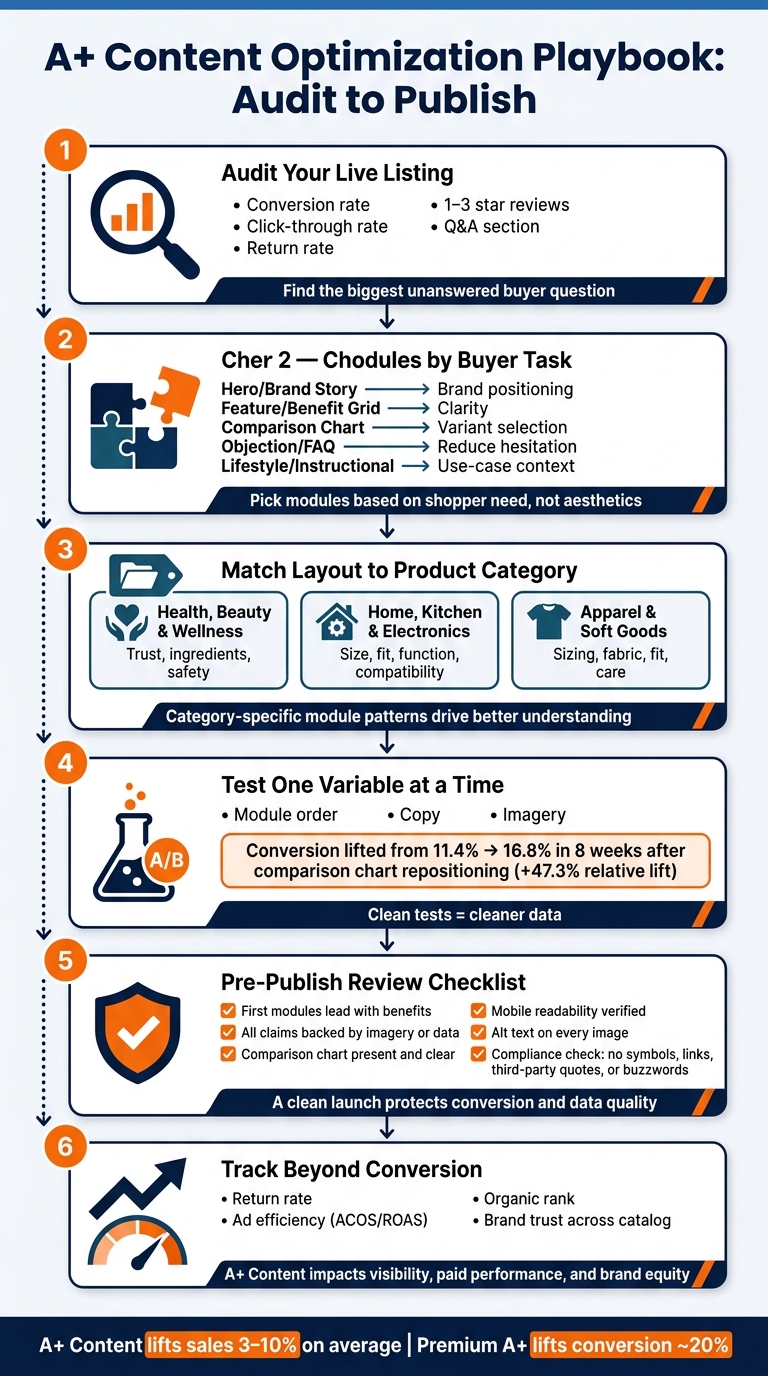
A+ Content Optimization Playbook: Audit to Publish
6 Examples of REALLY GOOD Amazon Premium A+ Content
sbb-itb-e2944f4
Quick Comparison
| Focus Area | What to Do | What It Helps With |
|---|---|---|
| Audit | Review metrics, low-star reviews, and Q&A | Find the top buyer question |
| Module choice | Use hero, benefit grid, comparison chart, FAQ, and lifestyle blocks based on shopper needs | Better clarity and less friction |
| Category setup | Match content to trust, function, or fit | Better product understanding |
| Testing | Change one item at a time | Cleaner read on results |
| Final review | Check mobile, claims, alt text, and policy rules | Fewer issues at launch |
In short: this guide is a step-by-step playbook for building A+ Content that explains the product better, reduces buyer doubt, and gives you cleaner data to improve the page over time.
A+ Content Page Anatomy and Module Selection
What A+ Content Should Do on a Product Page
Before you swap modules around, start with the live listing. Look at conversion rate, click-through rate, and return rate. Then dig into your 1–3 star reviews and the Questions & Answers section. Those signals tell you what shoppers still don’t understand. From there, decide which buyer question each module needs to answer. Your audit should point to the first trust, clarity, or comparison question that needs an answer.
A strong A+ layout usually follows a simple flow. It starts with a hero or Brand Story module, moves into a feature-benefit grid, uses a comparison chart to sort out variants, and finishes with an objection-handling module. Each block should answer one job. The hero sets the scene. The feature grid explains why the product matters. The comparison chart helps shoppers pick the right version. The objection module should tackle the single biggest concern you found in the audit so buyers feel less unsure.
Choose Modules by Buyer Task, Not Taste
Pick modules based on what the shopper needs to do, not what looks nicest. A lifestyle image can build interest. A comparison chart helps someone make a choice.
The table below shows what each module should handle.
| Module Type | Best Use Case | Information Density | Visual Impact |
|---|---|---|---|
| Hero Image / Brand Story | Brand positioning and keyword-rich alt-text indexation | Low | High |
| Feature/Benefit Grid | Benefit clarity and solving specific pain points | Medium | Medium |
| Comparison Chart | Variant/SKU selection and reducing purchase friction | High | Medium |
| Objection/FAQ Module | Intercepting purchase hesitation from negative reviews | Medium | Low |
| Lifestyle / Instructional | Use-case understanding and in-context scenarios | Low | High |
Alt text, headlines, and body copy are part of the module’s job. They shouldn’t be treated as separate SEO tasks.
Common Layout Mistakes That Lower Conversion
The most common mistake is putting a big banner at the top that looks polished but says very little about the product. On mobile, the first modules do most of the heavy lifting, so the opening should give shoppers clear positioning and useful details instead of a banner that’s mostly decoration.
Another problem is using long paragraphs instead of short lines and bullet points. People skim product pages. If the copy turns into a wall of text, many shoppers will skip it.
High return rates can hurt organic rank. If buyers send products back because sizing or product details weren’t clear, add scale or size-reference modules and make specs easier to spot. That helps set expectations before the order is placed.
Use this structure to match modules to the product categories in the next section.
A+ Content Examples by Product Category
Use the module logic above to match the main question shoppers have in each category.
Health and Wellness, Beauty, and Personal Care
In these categories, trust comes first. People want to know what’s in the product, how to use it, and whether it feels safe to buy. That means your A+ Content should lean on simple illustrations, steady brand colors, and a feature/benefit grid that spells things out fast.
For supplements and pediatric products, kid-friendly illustrations can do a lot of the heavy lifting. They help explain the product at a glance, without making the page feel dense. A feature/benefit grid also works well here because it gives shoppers a fast read on what the product does and why it matters.
At the end of the layout, add an objection-handling module that answers the concerns that show up most often in 1- to 3-star reviews. This is where you calm doubts before they turn into abandoned carts.
Keep the copy educational and policy-safe. Use clear product photography and visuals that support safety and reliability.
Home and Kitchen, Electronics, and Accessories
These categories live or die on fast proof of size, fit, and function. Shoppers want to see how the product works, what comes in the box, and whether it will fit their space or setup without guesswork. High-definition close-ups and action shots help answer those questions fast.
Always include a size or scale reference image. Showing the product in someone’s hands or next to a familiar object makes it much easier to judge size. That’s a small detail, but it can save a shopper from making the wrong call.
A comparison chart also helps separate models by details like:
- Size
- Wattage
- Compatibility
Clear sizing and compatibility details reduce returns.
Apparel and Soft Goods
With apparel and soft goods, the biggest sticking point is fit. If sizing feels vague, shoppers hesitate. So sizing and fabric details need to be easy to scan, not buried in a wall of text.
Give dedicated visual space to the details people check before they buy:
- Sizing charts
- Fabric close-ups
- Fit notes
- Care instructions
Lifestyle imagery works best when it shows the product on different body types and in different use cases. Family use is a good example. It helps shoppers picture the item in a lived-in, in-use setting instead of treating it like a flat catalog shot.
| Category Type | Best Layout Pattern | Key Module Selection |
|---|---|---|
| Health & Wellness, Beauty, and Personal Care | Educational & Trust-Based | Illustrations, brand colors, benefit grid, objection module |
| Home & Kitchen, Electronics, and Accessories | Technical & Functional | Close-ups, action shots, scale reference, comparison table |
| Apparel & Soft Goods | Lifestyle & Fit-Focused | Lifestyle imagery, sizing charts, fabric care details |
Use these category patterns as your starting point for testing and conversion review in the next section.
Case Study Framework, Testing Ideas, and Conversion Review
Case Study Structure: Problem, Content Changes, Result
Once you’ve matched modules to buyer tasks and category needs, the next step is simple: prove the new layout worked.
A clean way to do that is to use one structure: problem, change, result.
Start with the problem. Look for signals like low Unit Session Percentage, rising returns, or falling organic rank. Then spell out what content changes you made and why you made them. After that, track results over a meaningful time frame before deciding what the update did. The best place to test first is the module that answers the shopper’s biggest unanswered question.
Perch reported conversion rising from 11.4% to 16.8% over eight weeks after moving hero SKUs to Premium A+ and putting the comparison chart front and center. That matters because it shows a module decision can shift conversion, not just how the page looks.
| Metric | Baseline | Post-Update (8 Weeks) | Change |
|---|---|---|---|
| Conversion Rate (Hero SKU) | 11.4% | 16.8% | +47.3% relative lift |
Practical Test Ideas for A+ Content Updates
A smart first test is the comparison chart.
If your current layout doesn’t include one, add it and watch Unit Session Percentage week over week. If you see a move of more than 2 points, that’s a meaningful result.
Other tests worth running include:
- Leading with benefit-first hero content in the first visible module
- Using the last module to answer top review objections
- Adding a dedicated compatibility module if you sell multiple sizes or models to help cut returns
Keep the test clean. Change one variable at a time: module order, copy, or imagery.
Final Conversion Review Before Publishing
Before launch, do a pre-publish pass.
Make sure the first visible modules lead with benefits. Check that every claim in the copy is backed by an image or product data. Confirm that the comparison chart is present and helps reduce decision friction. Then read the full layout on mobile so you can catch walls of text and trim anything that isn’t easy to scan.
Also verify that every image has alt text. Amazon’s 2026 algorithm crawls these fields for indexation. On top of that, review compliance closely. Amazon strictly prohibits symbols, special characters, contact details, links, third-party quotes, or buzzwords like "cutting-edge".
| Review Area | What to Check | Why It Matters |
|---|---|---|
| Messaging | First modules lead with benefits | Supports Unit Session Percentage |
| Proof Points | Claims backed by imagery or data | Reduces purchase hesitation |
| Mobile Readability | Short text blocks and lists | Helps the content read well on mobile |
| SEO | Alt text on every image module | Supports keyword indexation |
| Compliance | No symbols, special characters, contact details, links, third-party quotes, or buzzwords | Prevents content rejection or removal |
A clean launch helps protect conversion and gives you cleaner data for the next round of updates. Those results can then shape broader marketplace growth priorities in the next section.
How A+ Content Supports Broader Marketplace Growth
Why Better Product Pages Matter Beyond Conversion Rate
Once the page is built and checked for conversion, the job isn’t over. The content on that page also shapes visibility, ad efficiency, and brand trust.
A strong A+ page does more than help close a sale. It can support organic visibility, build trust in the brand, and help paid traffic work harder.
Amazon’s ranking system now puts more weight on what shoppers do after they click than on keyword density alone. That means clearer A+ Content can help both ranking and conversion. If paid clicks don’t turn into sales, that can hurt organic ranking. Clear visuals and detailed product information also help shoppers pick the right item, which can keep returns low enough to avoid ranking pressure.
There’s also a branding effect that’s easy to miss. When shoppers see the same colors, logos, and lifestyle imagery across a catalog, new products feel more familiar and more trustworthy.
How Emplicit Supports Content-Led Marketplace Growth

At scale, those content wins need close coordination across channels. For large catalogs, Emplicit helps keep A+ Content consistent and aligned with PPC, inventory, and account health across major marketplaces and ecommerce channels.
Conclusion: What to Apply First
Start with the module that answers the biggest shopper objection. Then test, measure, and publish only when the page is clear, compliant, and easy to read on mobile.
FAQs
How do I know which A+ module to test first?
Start by checking customer reviews and your product listing’s Q&A. You’re looking for the details, objections, and pain points that have the biggest effect on buying decisions.
Because the first two modules shape that first impression the most, start your tests there with Amazon’s Manage Your Experiments tool.
You can also use PickFu to get fast feedback before you run a full A/B test.
One rule matters more than anything else here: test one element at a time. That’s how you get clean results you can actually use.
What metrics best show if A+ Content is working?
Track four core areas: conversion rate (also called Unit Session Percentage), shopper engagement, traffic quality, and customer satisfaction.
A few signals tell you a lot about how a listing is doing. Watch your add-to-cart ratio, sales per unique visitor, dwell time, video or carousel interactions, bounce rate, session value, return rates, and Q&A volume.
These metrics help you spot what’s working and what’s dragging performance down. For example, if traffic looks solid but sales per unique visitor stay low, your listing may not be doing enough to turn visits into purchases. If return rates or Q&A volume climb, shoppers may be confused about the product or its fit.
Use Amazon’s Manage Your Experiments tool to A/B test changes and confirm improvements.
How often should I update A+ Content?
Update your A+ Content at least every 3 to 6 months. If you launch a new product version, go through a rebrand, or notice conversion rates slipping, make changes sooner.
It also makes sense to refresh your content for seasonal shifts and new takeaways from customer reviews and FAQs. For top-performing ASINs, checking in more often can help keep rankings steady.