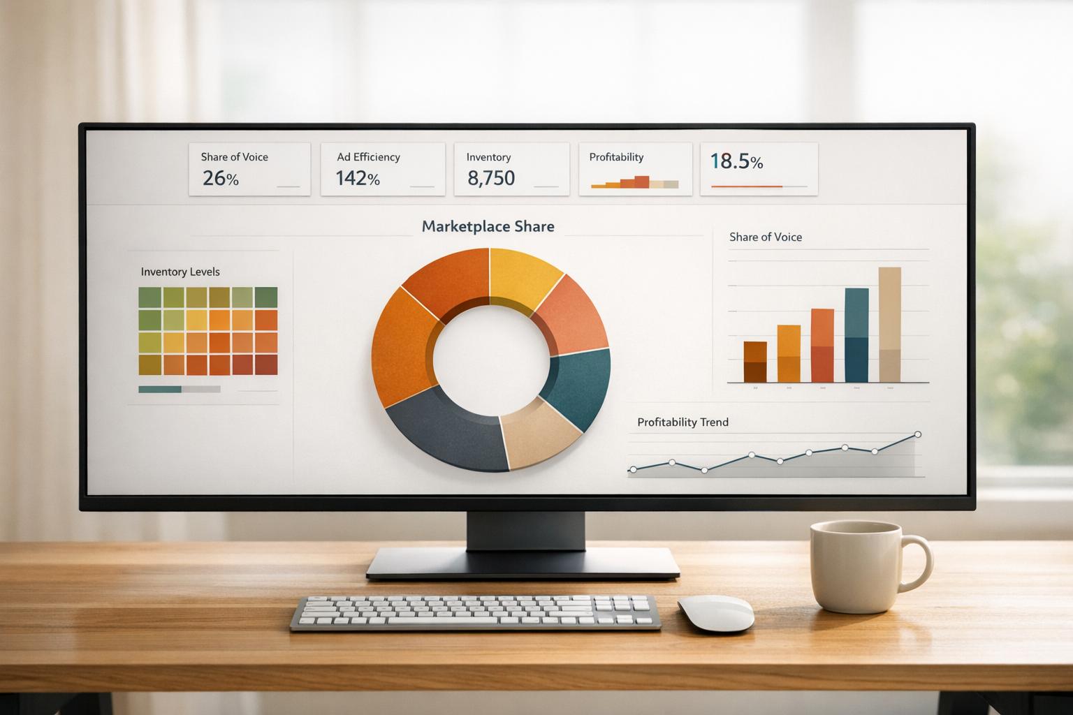
Marketplace share visualization tools simplify complex eCommerce data, like sales, search rankings, and ad performance, into clear, visual dashboards. These tools save time, provide insights into your competitive landscape, and help refine strategies for growth. Key features include:
- Unified Data Integration: Pulls data from platforms like Amazon SP-API, Walmart, and TikTok Shops.
- Critical Metrics: Tracks revenue, profitability, Share of Voice (SOV), Share of Search (SOS), Buy Box win rates, and advertising efficiency.
- Actionable Visuals: Uses line charts, bar graphs, scatter plots, and heatmaps to highlight trends and risks.
- Role-Based Insights: Tailored dashboards for executives, marketing teams, and eCommerce managers.
Visualize Competitor X’s 2024 Market Share vs. Industry Average Using Analytx?
Key Metrics and Visualizations in Marketplace Share Tools
This section focuses on the critical metrics and visualization methods that help businesses make smarter decisions in marketplace share analysis.
Key Metrics for Marketplace Share Analysis
Metrics like revenue, profitability, and visibility serve as the backbone of marketplace performance evaluation.
- Revenue and profitability are fundamental. Gross Merchandise Value (GMV) reflects total sales, while contribution margin reveals profitability after accounting for variable costs. As the ECOSIRE Team aptly puts it:
"Revenue is vanity; contribution margin is sanity." – ECOSIRE Team
For multi-marketplace sellers, a healthy contribution margin typically ranges from 15% to 30%. Monitoring this metric at the product and channel level is crucial to avoid blind spots in profitability.
- Visibility metrics enhance competitive positioning. Share of Voice (SOV) measures your brand’s ad and organic presence relative to competitors, while Share of Search (SoS) tracks how often your products appear for specific keywords. Brands with a positive Excess Share of Voice (ESOV) – where SOV exceeds market share – can see an annual market share gain of about 0.5 percentage points for every 10-point surplus.
- Buy Box metrics are another critical area. Losing the Featured Offer on Amazon can significantly hurt sales. Monitoring Buy Box win rates and leveraging suppression alerts can help recover lost revenue. For example, one brand reduced its average Amazon discount from 47% off MSRP to 15% by improving marketplace monitoring.
- Advertising efficiency ties everything together. TACoS (total ad spend/total revenue) is a key metric, with an optimal range of 8%–15%. Paired with inventory metrics like days of supply, this provides a complete operational overview. Real-time inventory tracking alone can prevent stockouts, which can cost mid-size sellers over $50,000 annually.
With these metrics in place, the next step is choosing the right visualizations to bring the data to life.
Common Visualization Types for Marketplace Share
The right charts can make data actionable, while poor choices can obscure insights. Here’s how different visualization types can help.
"Direction is often more important than dominance." – TickerTrends
- Line charts: Ideal for tracking revenue or market share trends over time, helping identify shifts and seasonal patterns.
- Stacked bar graphs: Useful for comparing revenue contributions across different marketplaces.
- Scatter plots: Perfect for pinpointing high-profit products by plotting margin percentages against sales volume.
- Bubble charts: Add depth to advertising analysis by visualizing ACoS, revenue, and ad spend simultaneously, showing where budgets are most effective.
- Heatmaps: Great for inventory management, mapping days of supply by product and channel to flag potential stockout risks.
- Gauge and traffic light indicators: Provide quick, visual updates on key metrics like Order Defect Rate (ODR) without requiring deep analysis.
| Data Type | Best Chart Type | Strategic Purpose |
|---|---|---|
| Revenue/share over time | Line chart | Spot growth patterns and seasonal shifts |
| Channel comparison | Stacked bar | Compare revenue across marketplaces |
| Product profitability | Scatter plot | Rank products by margin % vs. sales volume |
| Inventory health | Heatmap | Highlight stockout risks by product/channel |
| Advertising efficiency | Bubble chart | Analyze ACoS, revenue, and ad spend |
| Account health | Gauge/traffic light | Quick status updates on key metrics |
Emerging tools like geographic maps at the zip-code level are also gaining traction. These maps use hyperlocal data to uncover regional share gaps and optimize inventory and ad spend, providing insights beyond the standard national-level dashboards.
Core Features of Marketplace Share Visualization Tools
Gathering the right metrics is only half the battle. The real challenge lies in transforming those numbers into clear, actionable visualizations that drive smart decisions in competitive marketplaces. The tools you rely on for data collection, display, and sharing play a big role in whether those insights truly guide your strategy.
Data Integration and Sources
At the heart of any effective marketplace share tool is its ability to pull data from a variety of sources. The best tools use secure APIs – like Amazon’s SP-API – to sync sales, advertising, and inventory data in real time. This eliminates the need for manual uploads or juggling spreadsheets, which are prone to errors.
What sets advanced tools apart is their ability to handle data normalization. Different platforms – Amazon, Walmart, TikTok Shops – report metrics in their own formats. A good tool standardizes these into consistent, comparable figures, making cross-channel comparisons of metrics like conversion rates or revenue far more reliable.
But it doesn’t stop at sales data. A strong platform also incorporates advertising metrics (PPC and DSP), costs of goods sold (COGS), shipping fees, and competitive insights like Share of Voice. Take Sellertics, for instance. It automates cost imports across these categories and tracks over $2.4 billion in revenue for more than 12,000 sellers across six marketplaces. One seller shared:
"Finally I can see my real profit after Amazon fees, FBA costs, and refunds – all in one screen. Sellertics changed how I make restocking decisions." – Rajesh Kumar, Amazon FBA Seller
With this level of integration and standardized data, dashboards can truly unlock the potential of these insights.
Interactive Dashboards and Reporting
Once your data is integrated, a powerful dashboard becomes the key to transforming raw numbers into meaningful insights. The best dashboards allow users to start with a high-level view and drill down into specific details – like an ASIN or keyword – quickly and efficiently. This drill-down capability turns reports into actionable tools.
Automated reporting is another game-changer, saving time and boosting productivity. Platforms like DataHawk excel in this area, offering analytics and reporting features that are hard to replicate manually. As Thomas Gragnic, Digital Services Manager at T’nB, noted:
"DataHawk had all the data and features we needed, with analytics and reporting capabilities we couldn’t find elsewhere." – Thomas Gragnic, Digital Services Manager, T’nB
Modern tools are taking it even further with conversational AI for instant, plain-language insights. Plus, they integrate seamlessly with enterprise BI tools like Tableau, BigQuery, and Power BI, making it easy to fit into existing workflows rather than forcing teams to adapt to new systems.
Collaboration and Access Control Features
A great visualization tool isn’t just about displaying data – it’s about ensuring the right people see the right data. Different roles within a company – category managers, marketing leads, operations teams, and executives – need tailored insights. Role-based access controls make this possible by customizing views for each team member, cutting down on unnecessary clutter and avoiding dashboard fatigue.
Well-designed platforms typically offer tiered dashboards: quick overviews for executives, channel performance insights for eCommerce managers, and detailed operational data for teams managing day-to-day tasks. This means a CEO can get a concise daily snapshot, while a category manager dives into SKU-level trends – all using the same tool.
The ability to export data is also critical for collaboration. Whether it’s raw data, pivot tables, or polished reports in PDF or CSV formats, seamless exporting ensures insights flow into internal planning tools, agency reports, or quarterly business reviews without a hitch. As one VP of eCommerce put it:
"There’s a great selection of widgets available in the custom dashboard builder. The options to organize the grid by choosing the width of each component, and the ability to build team-level reporting views… makes marketplace reporting a part of how your team works." – Vice President, eCommerce, Floor & Industrial Equipment Manufacturer
How to Choose the Right Marketplace Share Visualization Tool
Picking the right tool can make all the difference when it comes to turning data into actionable insights. Let’s break it down.
Defining Your Business Requirements
Start by identifying your specific needs. Is your main issue scattered data or hard-to-read visualizations? Understanding this will guide your decision.
For smaller brands (under $1M), free or budget-friendly tools might do the job. Brands in the $1M–$10M range often benefit from tools with a unified data layer. Larger businesses exceeding $10M typically require a more advanced BI setup, including a custom data warehouse. Also, consider who will use the tool – whether it’s for high-level executive summaries or daily operational tracking.
Evaluating Technical Capabilities
Look closely at how each tool handles data. Does it integrate smoothly with your key platforms using secure APIs? Can it provide real-time updates for orders and inventory, as well as daily refreshes for advertising data? Historical data retention is another critical factor – 90 days often isn’t enough for meaningful analysis, while some tools offer up to two years of history on growth-tier plans.
If your team already uses enterprise tools like Tableau, BigQuery, or Power BI, make sure the visualization tool can push data directly into those systems. The last thing you want is to create another data silo.
Finally, balance technical capabilities with cost and ease of use. The tool should fit your budget but also align with your team’s daily workflows.
Cost and Usability Considerations
Pricing usually depends on order volume and the number of marketplace connections. Entry-level plans often start at $19/month for up to 500 orders. Growth-tier plans, which handle up to 5,000 orders and include cost automation, typically cost around $49/month. Enterprise-level plans offer custom pricing, API access, and dedicated support. Choosing the wrong tool could lead to wasted time – up to 5–10 hours per week spent on manual reconciliation.
Usability is equally important but often overlooked. A tool might be powerful, but if it’s confusing to use, it won’t get much traction with your team. Take advantage of free trials to see if the interface works for your day-to-day needs. Onboarding is another key factor – some platforms offer free onboarding sessions, which can make all the difference in how quickly your team adopts the tool.
"Great insight only matters if it’s usable. Marketplace Insights lets your team export exactly what they need… and plug it directly into planning, reporting, or internal dashboards." – TrackStreet
For businesses managing over 500 orders per month across multiple marketplaces, investing in a professional dashboard often pays off within two to three months. The time savings and better decision-making alone can justify the cost. By following these criteria, you can ensure the tool you choose simplifies your decision-making process.
sbb-itb-e2944f4
How to Implement Marketplace Share Visualization Tools
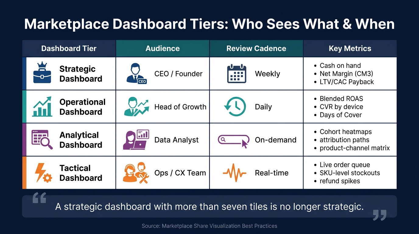
Marketplace Dashboard Tiers: Who Sees What & When
Setting Objectives and KPIs
Before diving into dashboards, it’s essential to establish clear objectives and measurable KPIs. Goals like "grow our Amazon presence" are too vague to be useful. Instead, focus on specific, actionable metrics. For example, aim to increase your share of voice (SOV) in a subcategory like Sports Nutrition > Protein Powders by a certain percentage within the next quarter. Or, set a goal to reduce your total advertising cost of sales (TACoS) over a specific timeframe.
From day one, track both SOV and revenue share, while keeping unit share as a separate metric. If there’s a significant gap between revenue share and unit share, it could indicate either a pricing issue or an opportunity to position your product as a premium offering. As Prashant Rana, CEO of Sipransh Ecommgrowth, explains:
"Amazon market share is more than a performance metric – it’s one of the clearest indicators of brand strength, competitive positioning, and long-term marketplace opportunity."
For instance, if your brand generates $80,000 in monthly sales in a category worth $2,000,000, your market share is 4%. Tracking this weekly provides a clear, shared goal for your entire team. Once your KPIs are in place, structure dashboards to align with these objectives.
Building and Customizing Dashboards
Dashboards aren’t one-size-fits-all. Tailor them to the needs of your audience by creating distinct views for different roles. Here’s a breakdown of how to categorize them effectively:
| Dashboard Tier | Audience | Review Cadence | Key Metrics |
|---|---|---|---|
| Strategic | CEO / Founder | Weekly | Cash on hand, Net Margin (CM3), LTV/CAC Payback |
| Operational | Head of Growth | Daily | Blended ROAS, CVR by device, Days of Cover |
| Analytical | Data Analyst | On-demand | Cohort heatmaps, attribution paths, product-channel matrix |
| Tactical | Ops / CX Team | Real-time | Live order queue, SKU-level stockouts, refund spikes |
This tiered approach ensures dashboards remain focused and relevant. As Luca advises, "A strategic dashboard with more than seven tiles is no longer strategic."
To make dashboards actionable, include decision-trigger annotations. For example, flag campaigns for review if your customer acquisition cost (CAC) exceeds the target for seven consecutive days. Similarly, set up reorder alerts when inventory drops below a 15-day supply. These triggers turn raw data into tools that drive action.
Turning Visual Insights into Action
Once your dashboards are set up and KPIs are defined, the real work begins: using the insights to drive decisions. Data alone doesn’t create change – it’s the actions you take based on that data that matter. For instance, audit gaps between clicks and conversions by optimizing product listings for keywords with high click volume but low conversion rates. Alternatively, increase PPC bids on keywords with high conversions but low click volume.
Sellers who incorporate Brand Analytics data into their weekly processes often uncover 15%–20% of ad spend that can be redirected to better-performing terms within the first month. On the inventory side, ensuring real-time cross-channel visibility can prevent stockouts, which can save mid-size sellers over $50,000 annually.
Keep your review process simple to ensure insights remain actionable. For example:
- Daily: A quick 30-second executive health check.
- Weekly: A 5-minute review of channel performance.
- Weekly: A 15-minute SKU-level product review.
Reserve deep-dive sessions for unexpected issues. As Titan Insight aptly puts it:
"Data without a decision cadence is noise."
How Emplicit Supports Marketplace Share Growth
Emplicit takes raw marketplace data and turns it into actionable strategies. By combining a strong analytics platform with expert guidance, they help brands grow their presence on platforms like Amazon, Walmart, and TikTok Shop. Their approach revolves around making data easy to understand and using it to create clear growth strategies.
Emplicit’s Approach to Marketplace Share Visualization
Emplicit relies on two powerful tools – Stonehenge and myHorizons – to drive its analytics capabilities. Stonehenge processes and adds 2 million new Amazon data points daily. It syncs seamlessly with Google Drive or private databases, ensuring brands always have up-to-date, clean data for analysis.
"You shouldn’t need a programmer or data scientist to make sense of your own reports." – Emplicit
The myHorizons platform then brings this data to life with a user-friendly dashboard, designed with brands in mind. Teams can quickly switch between high-level summaries and detailed ASIN-level insights. The platform provides real-time competitive intelligence, helping brands spot rising competitors, track subcategory trends, and uncover untapped opportunities before others catch on. Audrey Lovick of Emplicit explains:
"This tool was built to translate data into strategy. And strategy into scale."
Stonehenge also identifies unclaimed reimbursements, recovering an average of 3% of total sales for brands. This combination of advanced data visualization and actionable insights forms the foundation of Emplicit’s hands-on services, which are designed to maximize marketplace growth.
Emplicit’s Services for Marketplace Growth
Emplicit goes beyond data visualization by offering tailored services that turn insights into action. These services are informed by the data surfaced daily through Stonehenge and myHorizons.
- PPC Management: Emplicit’s team aligns advertising spend with market share performance. They focus on reallocating ad budgets to promising, less competitive categories, ensuring ad dollars are spent effectively.
- Listing Optimization: Using ASIN-level data, Emplicit pinpoints which product pages need updates – whether it’s improving copy, updating images, or refining attributes – avoiding a one-size-fits-all approach.
- Inventory Alerts: Stonehenge includes custom alerts that notify brands of low stock levels, helping to prevent costly stockouts and wasted ad spend.
- Reseller Management: Proprietary software monitors unauthorized sellers, protects Buy Box ownership, and enforces MAP compliance, preserving both revenue and brand reputation.
- Tariffalyzer Tool: This tool calculates fluctuating tariff rates, helping brands manage import costs and stay competitive in pricing.
Emplicit also recovers lost revenue by identifying unclaimed Amazon reimbursements, which typically account for around 3% of total sales.
Here’s a quick breakdown of how these services impact marketplace share:
| Service | What It Does | Impact on Marketplace Share |
|---|---|---|
| PPC Management | Redirects ad spend to high-potential categories | Increases visibility and reduces wasted spend |
| Listing Optimization | Updates copy, imagery, and attributes at the ASIN level | Boosts conversion rates and organic rankings |
| Inventory Alerts | Sends low-stock notifications via Stonehenge | Prevents stockouts and lost sales |
| Reseller Management | Tracks unauthorized sellers and enforces MAP | Protects Buy Box and brand trust |
| Reimbursement Recovery | Finds unclaimed Amazon reimbursements | Recovers ~3% of total sales |
With these services, Emplicit ensures that every piece of data leads to measurable results, helping brands strengthen their marketplace position and grow their share.
Conclusion: Growing Your Marketplace with Visualization Tools
Marketplace share visualization tools have transformed raw data into actionable insights for brands on platforms like Amazon, Walmart, and TikTok Shop. This shift marks a new era, paving the way for AI-driven insights to take center stage.
It’s important to remember that revenue alone doesn’t tell the full story. As the ECOSIRE team aptly puts it, "Revenue is vanity; contribution margin is sanity." Keeping a close eye on margins across different channels leads to decisions that truly move the needle.
These tools are becoming more sophisticated. AI-powered systems now not only identify trends but also explain the "why" behind them and suggest next steps. By 2027, conversational interfaces will allow users to ask simple, plain-English questions and instantly receive clear visual answers.
Brands that succeed in this evolving landscape are the ones that act on their data consistently. This means regularly reviewing channel performance, setting automated alerts for inventory and Buy Box changes, and aiming for subcategory benchmarks. Prashant Rana, Founder and CEO of Sipransh Ecommgrowth, emphasizes:
"Amazon market share is more than a performance metric – it’s one of the clearest indicators of brand strength, competitive positioning, and long-term marketplace opportunity."
Whether you’re starting with a unified dashboard or diving into AI-enhanced insights, one thing remains constant: clear, consistent data is the foundation for sustained growth.
FAQs
Which marketplace metrics should I track first?
Tracking the right metrics is essential to understanding your business’s performance and overall health. Start with Gross Merchandise Value (GMV), which gives you a clear picture of your total activity. Combine this with your take rate to evaluate how efficiently you’re generating revenue.
Pay attention to your conversion rate to gauge how effectively you’re turning visitors into customers. Keep an eye on Average Order Value (AOV) to identify opportunities for growth. Additionally, compare your Customer Acquisition Cost (CAC) with your repeat customer rate to assess the efficiency of your marketing efforts and the loyalty of your customers.
These metrics, when analyzed together, provide actionable insights that can fuel sustainable growth over time.
How do I calculate market share on Amazon?
To figure out your market share on Amazon, you’ll need to compare your performance against the overall category or niche. The most common ways to measure this are through revenue and unit sales.
Here’s how you can calculate it:
- Revenue share: (Your Revenue ÷ Total Market Revenue) × 100
- Unit share: (Your Units Sold ÷ Total Market Units Sold) × 100
Just make sure that all the data you’re using comes from the same time frame. Tools like Emplicit can assist brands in analyzing these metrics and finding ways to grow on Amazon.
What data integrations should a dashboard tool support?
A marketplace share dashboard needs to bring together data from a variety of sources to give a complete picture of performance. This includes pulling in information about orders, inventory levels, advertising metrics like ACOS and ROAS, and customer engagement statistics.
To make this work, the dashboard should connect with essential APIs such as Amazon Seller Central, eBay Seller Hub, Walmart Seller APIs, and Shopify. It should also integrate with tools for ERP/financial management (like Odoo) and shipping carriers to monitor deliveries. This kind of integration allows for smooth cross-platform reporting and delivers unified insights across all channels.